I am the Art Director For Napper: the peaceful parenting app. Over the past year, we’ve had some challenges! Read more to see my favourites.


Napper Projects
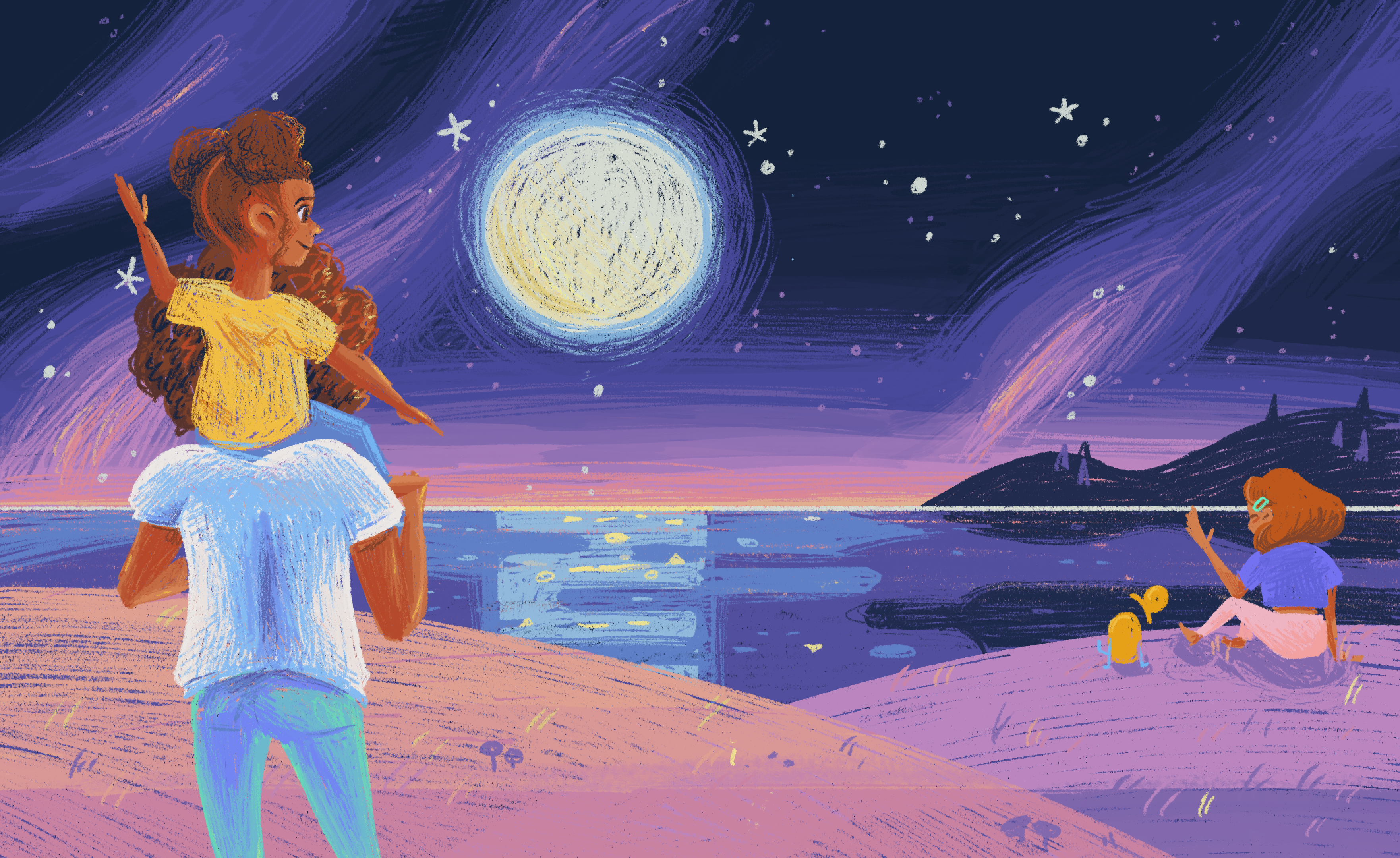
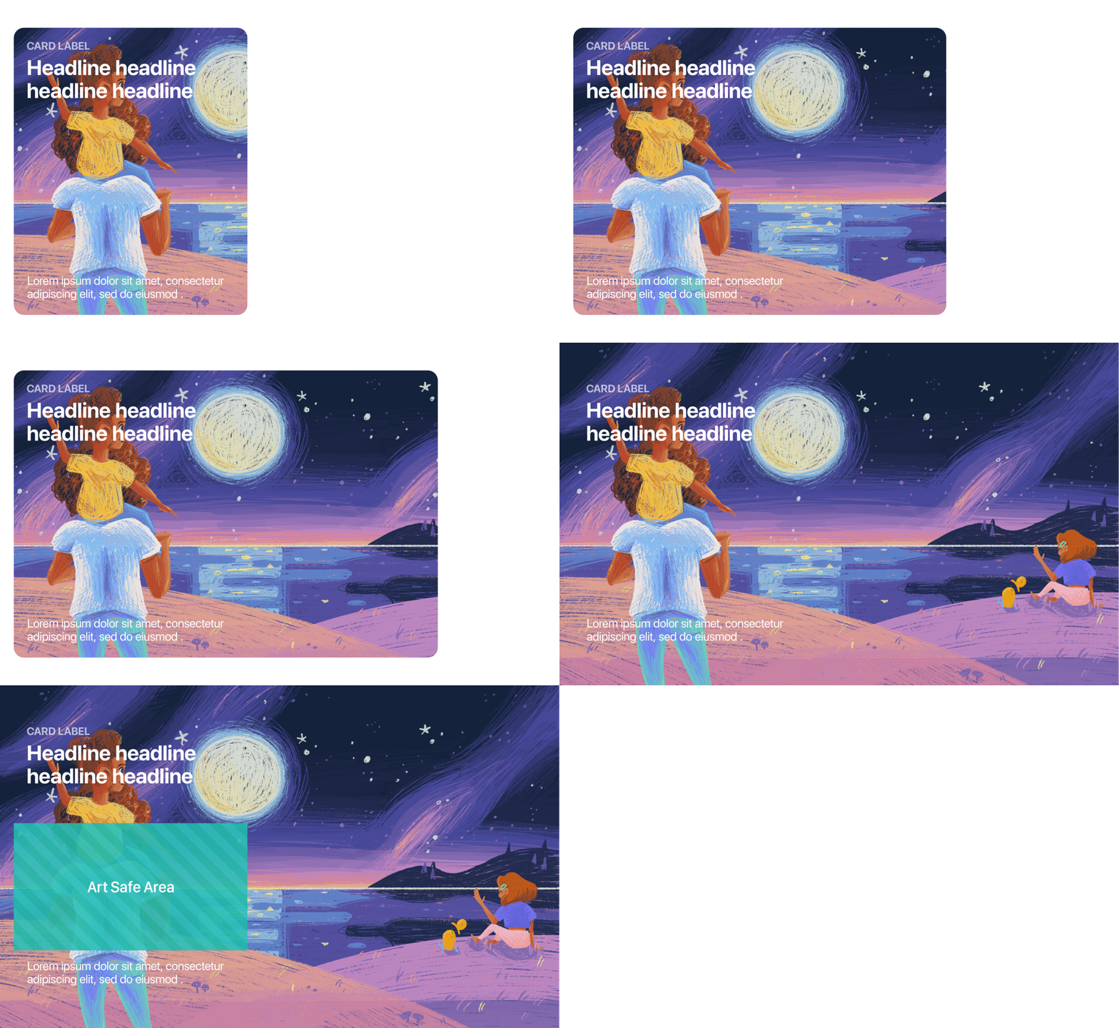
I had 48 Hours to make our Apple App store images.
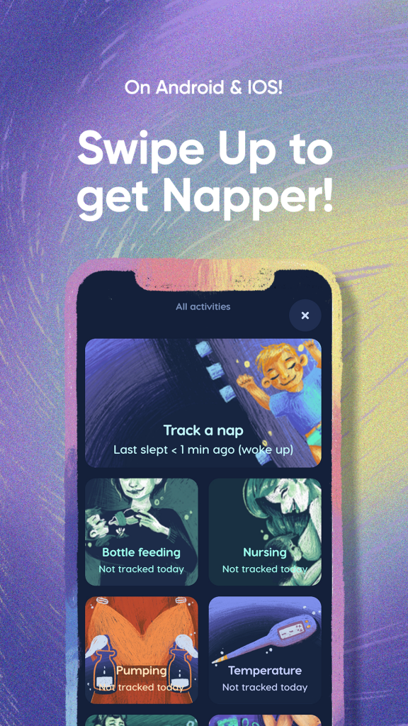
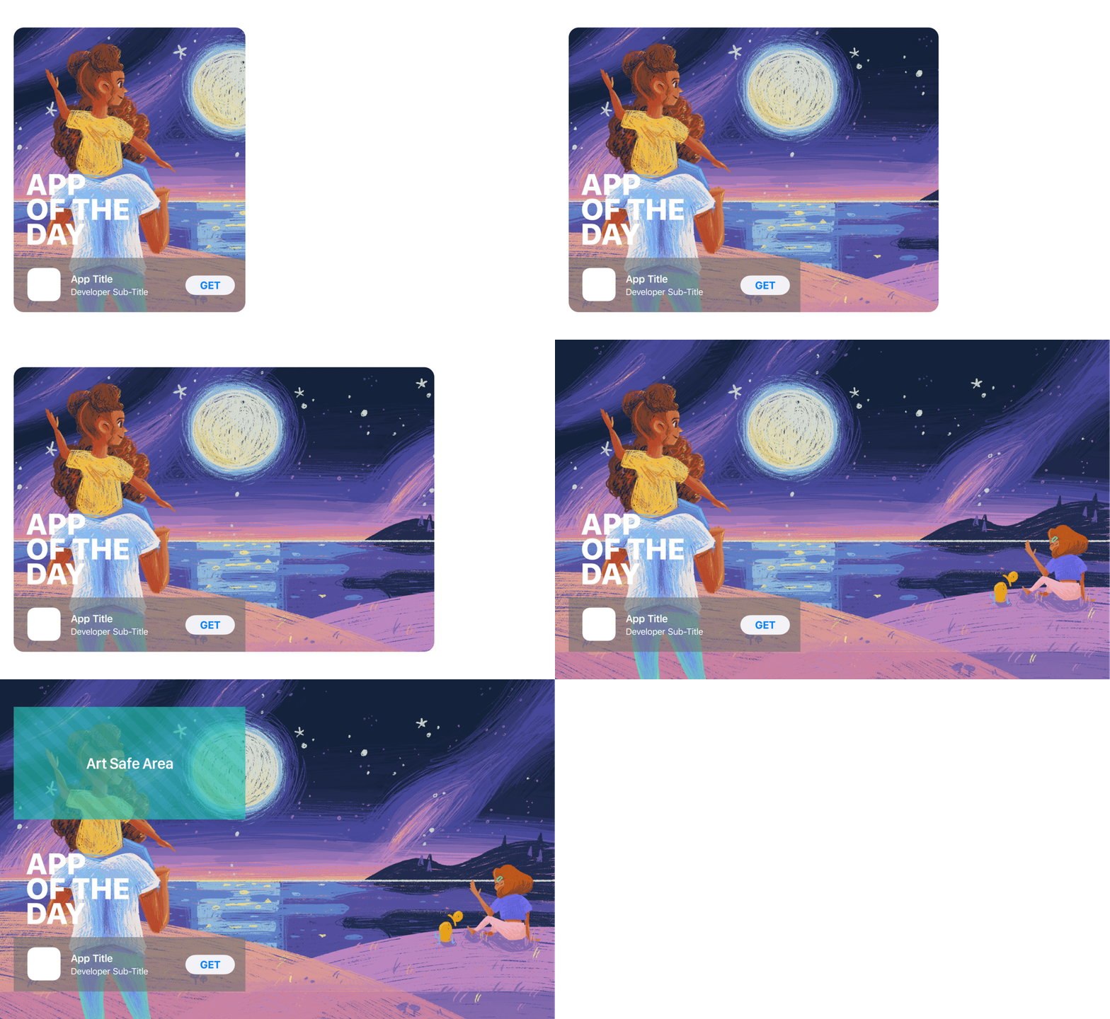
We had an email – Napper was getting featured on Apple’s today page, that Friday! It was Wednesday, so I got to work. We quickly decided to go with a look, similar to the website homepage. Warm, star-studded landscapes.


To break down the brief:
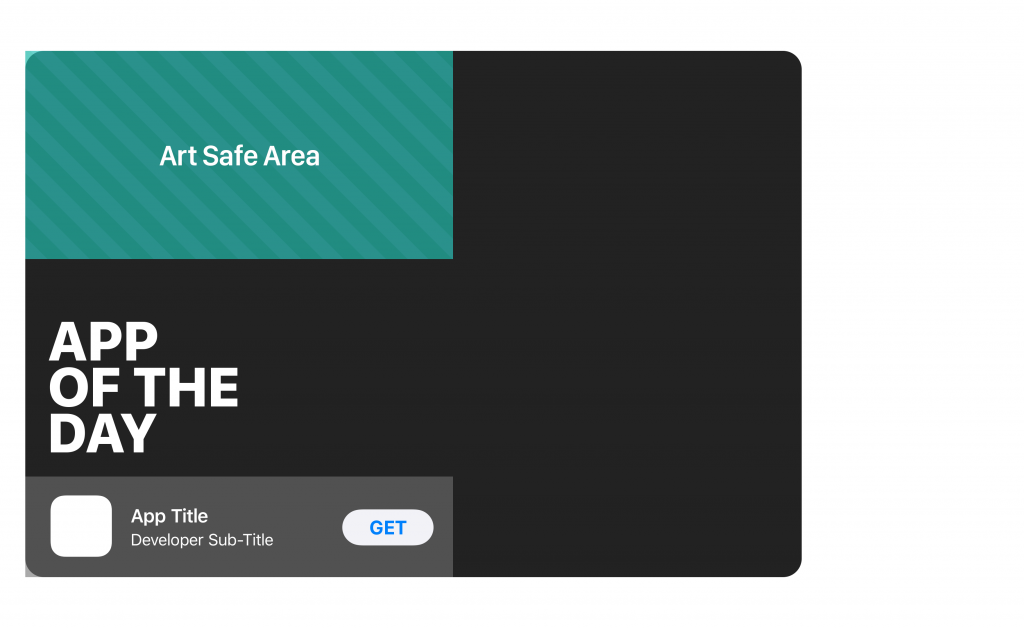
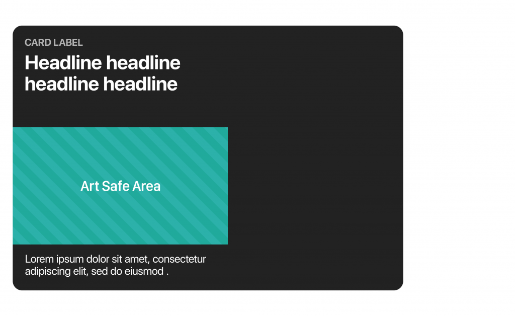
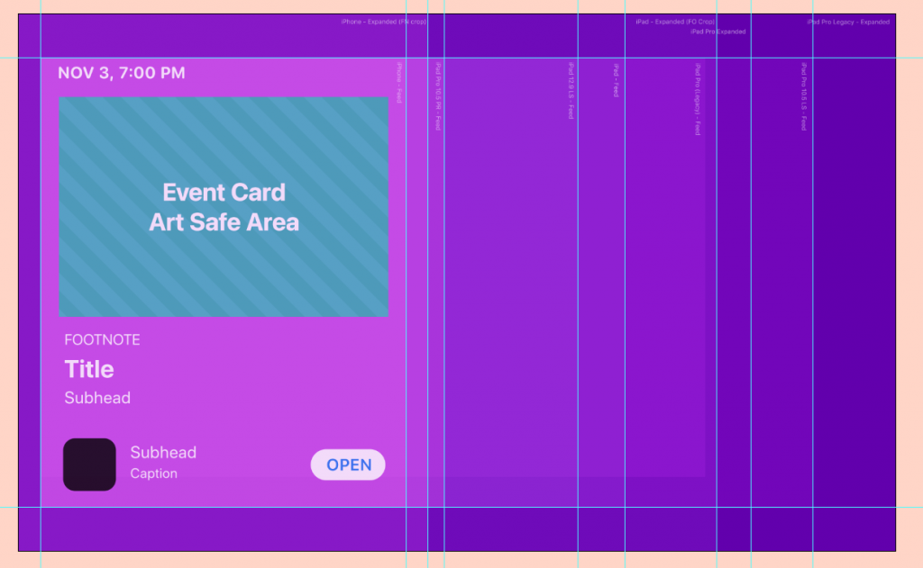
Apple wanted 5 different headers, that worked on many different aspect ratios, with widely varying art safe areas. You can see from the sample files that they were asking for some very specific areas of focus for those illustrations. Since it was just me building this (we’re a small start-up!) I started problem-solving. The biggest challenge here was making these headers work how we wanted, even with all the typography over the top.
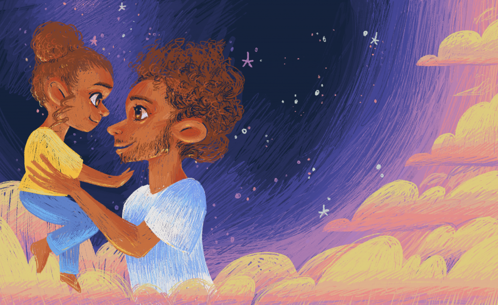
Event Illustration Process
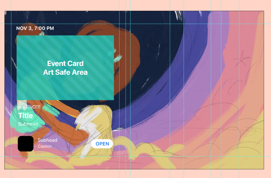
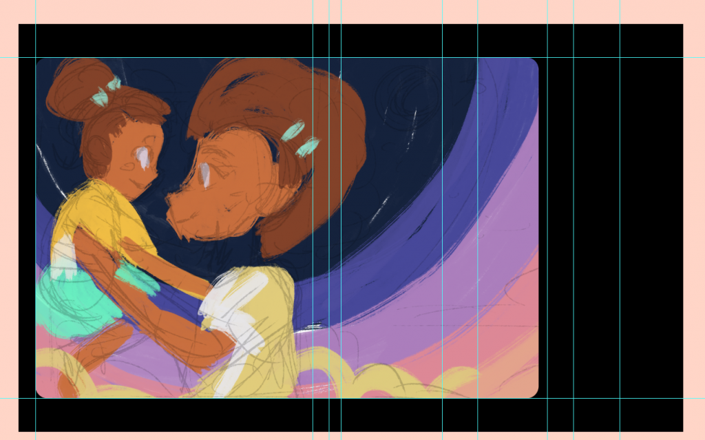
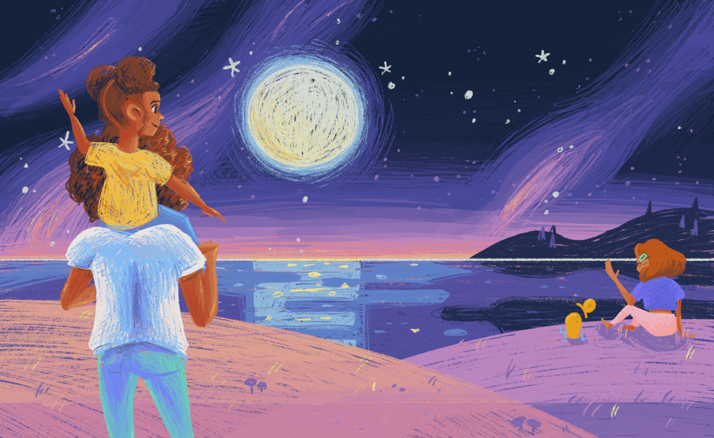


I went back and redid this illustration because we felt it needed to be moodier!
Since this was an after-the-fact sort of thing, I had a bit more time to use my head and make a really good quality illustration! Starting from the idea of the forest at night, I think I ended up with something pretty snazzy.


The lesson I learnt
While I can still produce pretty great results working under time constraints, the creative decisions aren’t as fleshed out. I like a challenge, but I like making beautiful, precise things even more.
Thank you for taking your time to read this case study on that time I had 48 hours to make 5 headers!
WebsiTE Work
I’ve done a few things for Napper’s homepage!
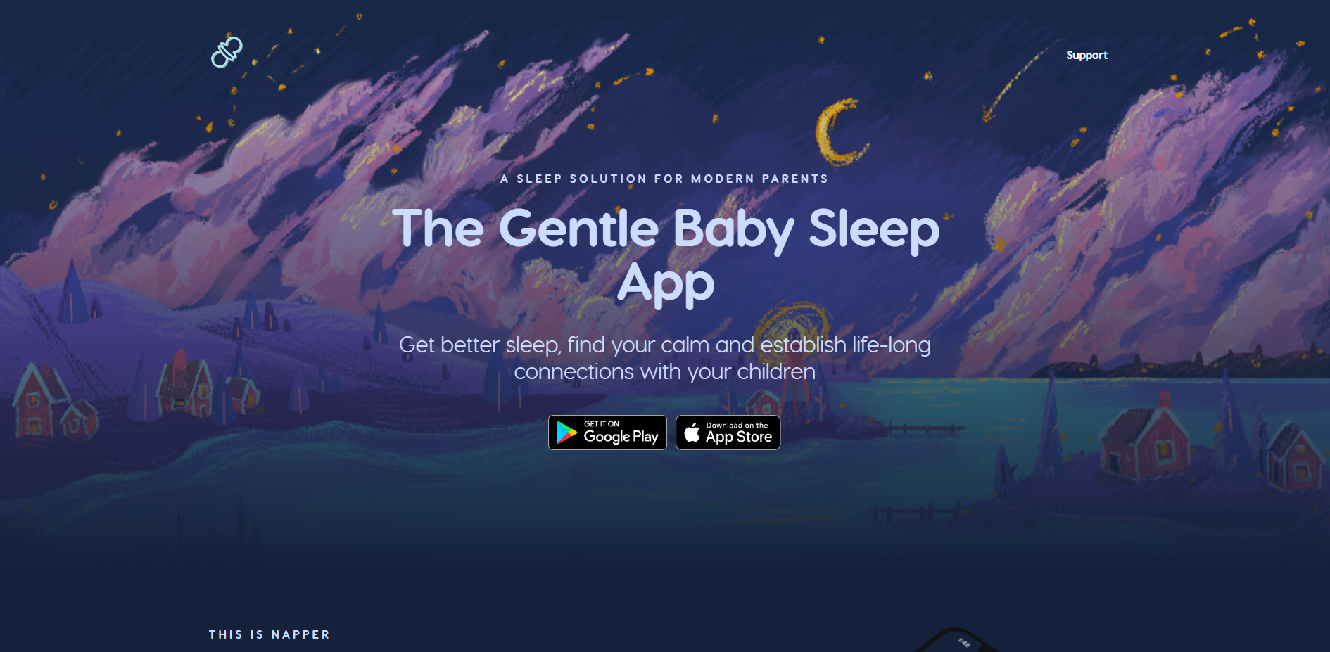
Napper’s website is an ongoing, collaborative project! There are multiple people working on it, and it changes pretty often. Here are my contributions.
Homepage Illustrations
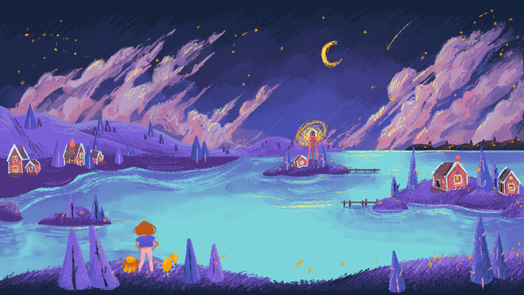
I’ve made all the art on the homepage. This homepage illustration really set the style for Napper’s landscapes going forward. I’d love to share with you that journey.
About Us Illustrations
At the time of writing, the about us page hasn’t rolled out yet. Being a small startup, we’re pretty busy! I hope that by the time you read this it’ll be there!
Napper Homepage Process
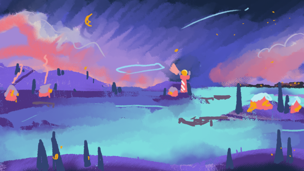
My first sketches for Napper’s homepage came from 2020. Back then, we were still trying to pin down Napper’s characters, Art Style & whole vibes. Before I joined the crew, it was a very functional app; without a huge amount of personality. From this, we workshopped some directions for Napper’s page to go, in a general sense!
Here you can see the chronological development of the ideas we had, from 2020 to now! You can see how far I have come artistically, from fresh out of school to now.
Coming to our current header was a journey!
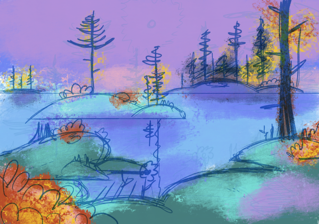

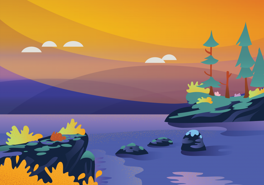

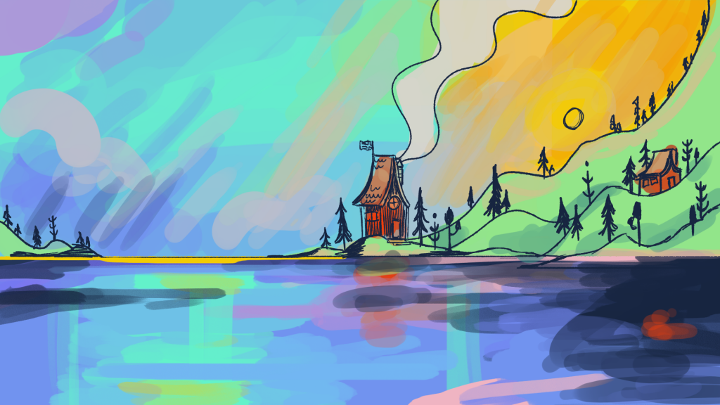
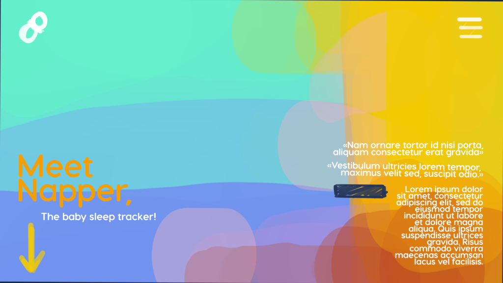
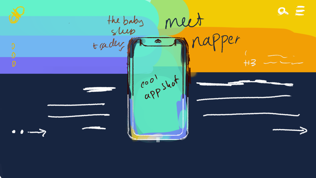
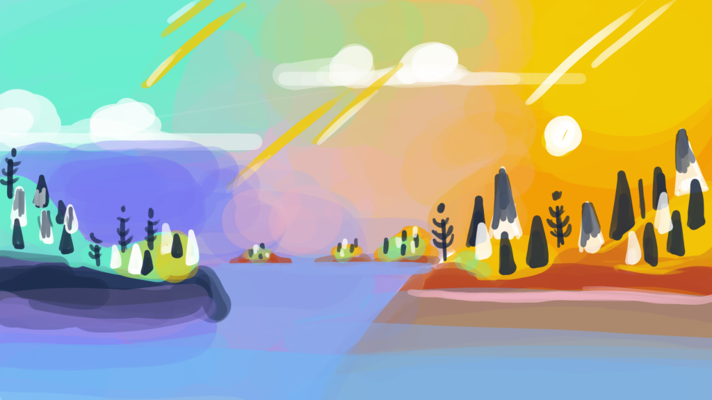
A few weeks later, I landed on the right vibes.
Review Art
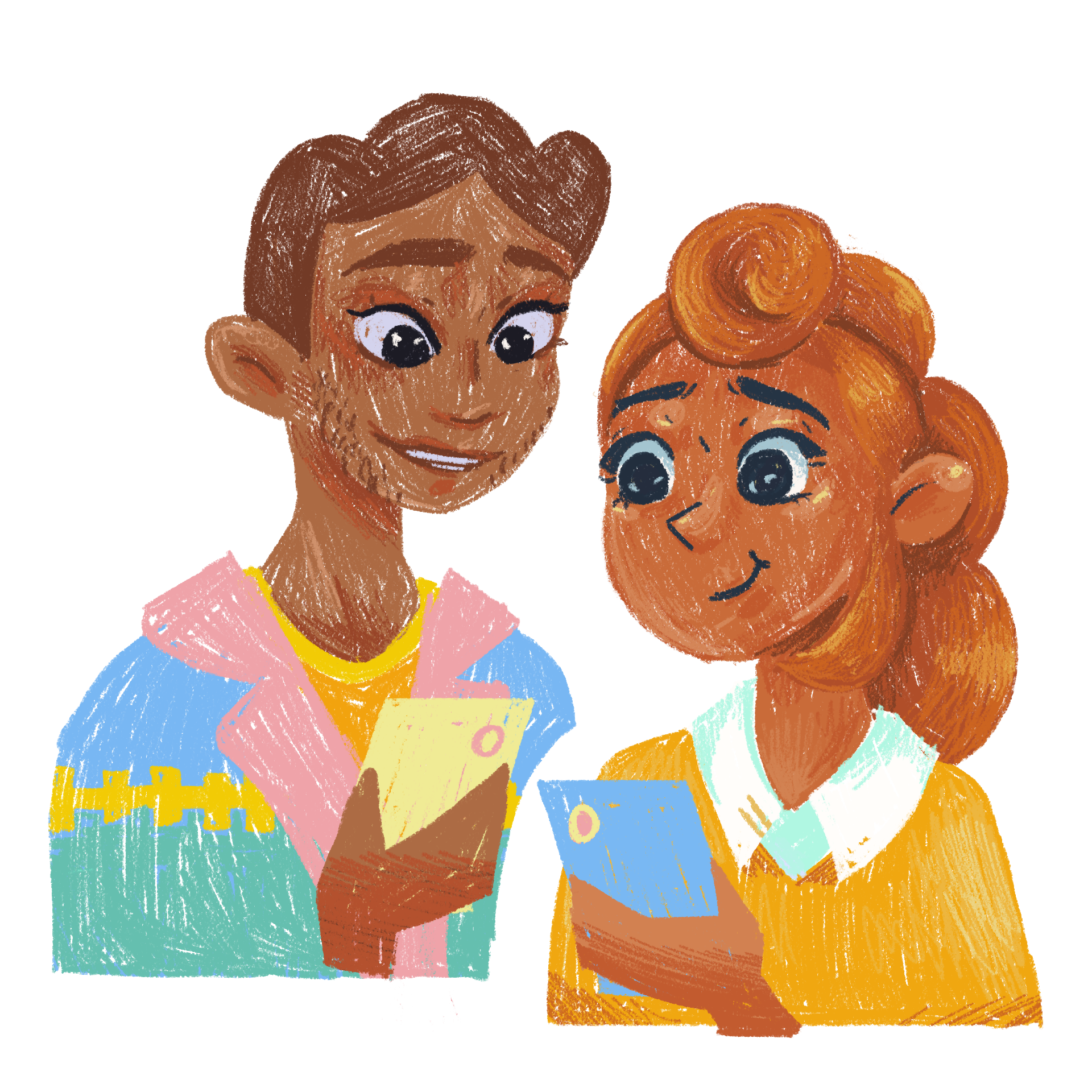
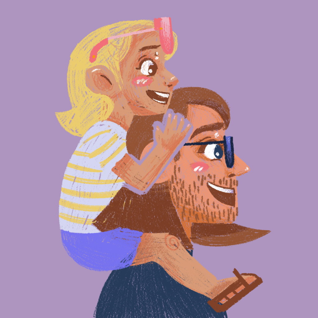
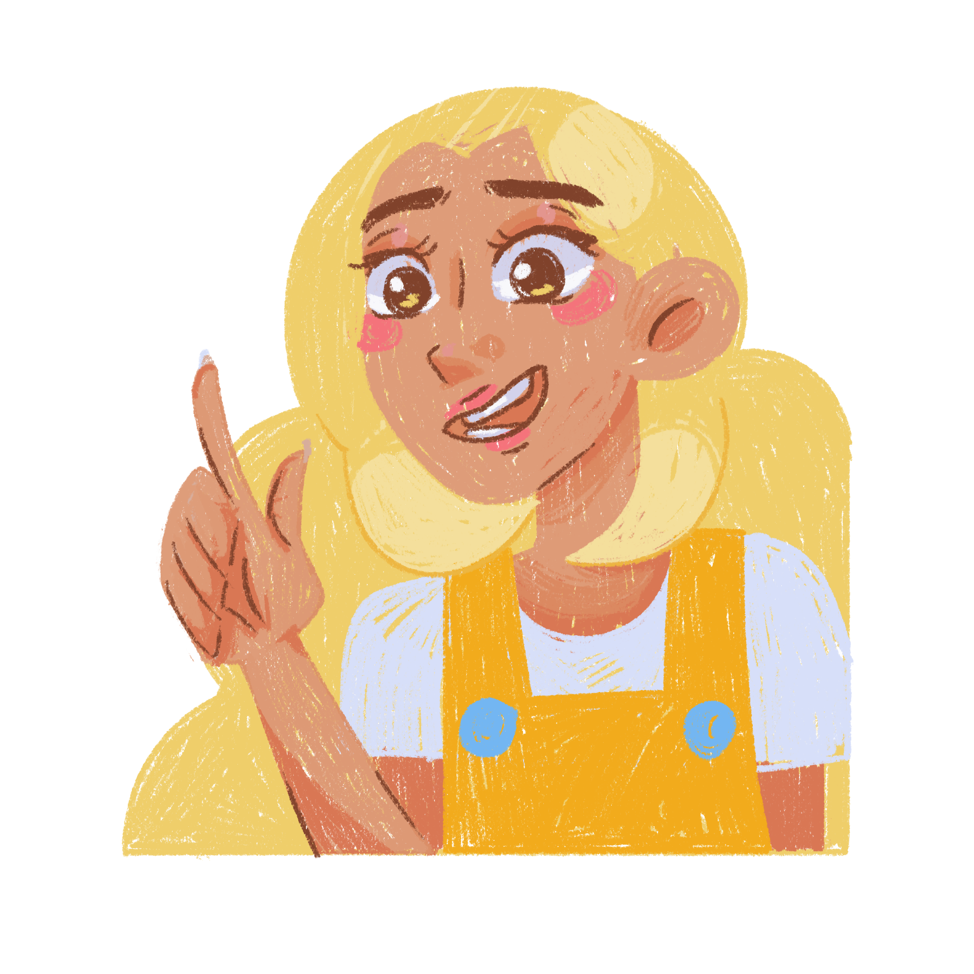
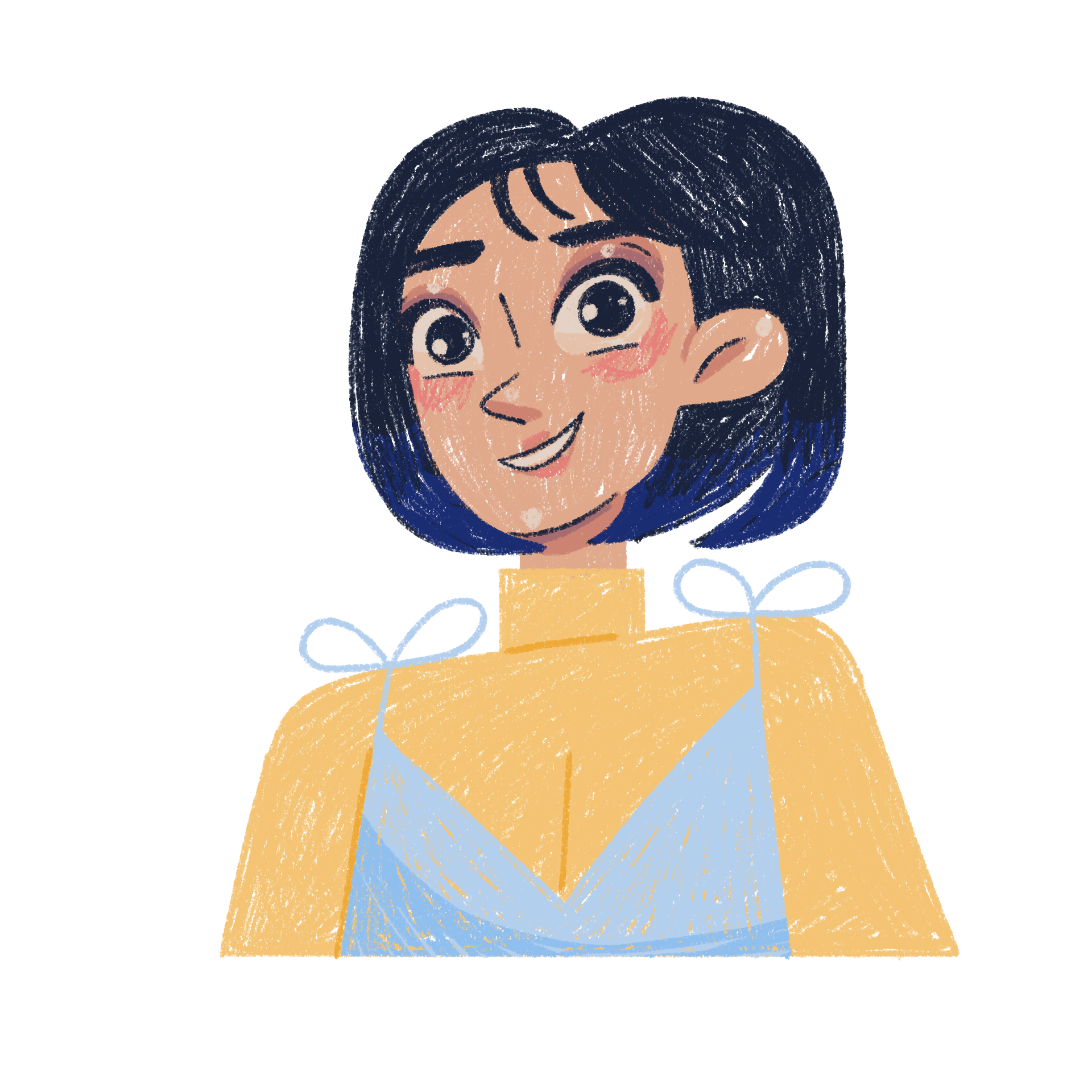
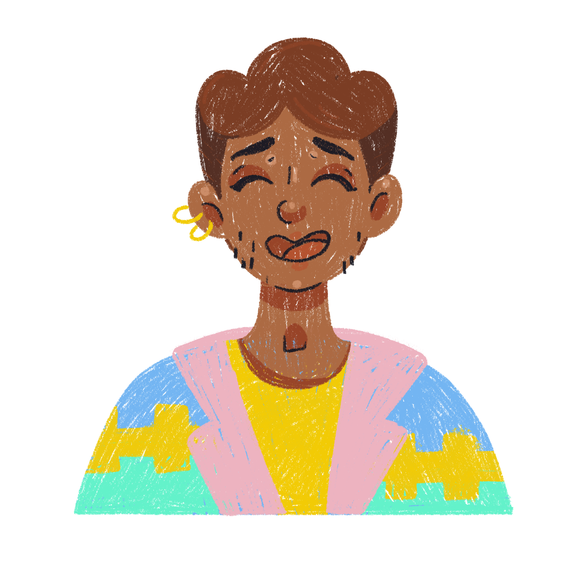
We wanted a way to represent the parents who might use our app. So, after developing our characters, we started using them to represent our wonderful parents. This is good in a few ways, 1) Brand touchpoints, 2)Functionality and 3) Privacy.
- Brand touchpoints! Our characters are representative of the Napper brand
- Functionality – We don’t have to worry about getting the perfect photo from a parent. We can whip up a specific, unique illustration, that we know will work. This means brand colours, in the brand style.
- Privacy – We respect our parents! Their parenting journey is as private as they want it. Using charcters to represent our parents reflects that value.
About Us Illustrations
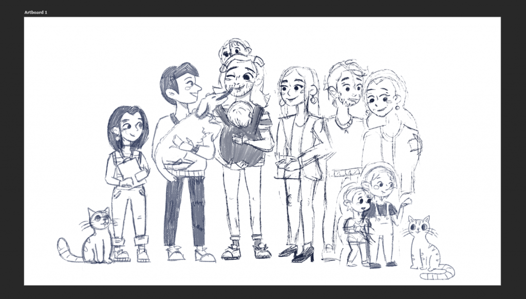
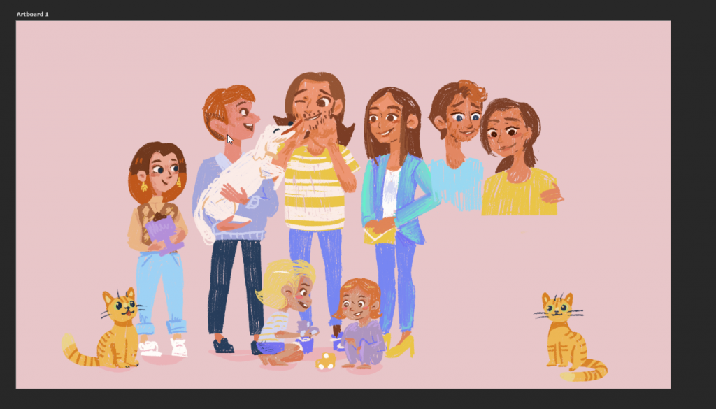
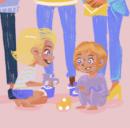
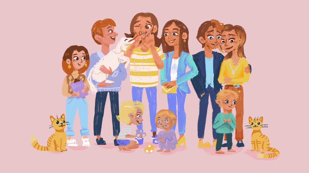
We wanted to show that we, at Napper, are a team of normal people, just like the parents using our app! We wanted an illustration showing all of us, together. This probably might’ve been a photo pre-pandemic but we wanted to play it safe.

Thank you for Reading!
Man, the homepage work is neverending but it’s rewarding to see it all come together into a really nice, cohesive look. I think my favourite thing to paint has got to be the homepage header, and I still want to do more with it as a piece of animation. That’ll come later though!
Baby Sleep Course
How do we teach busy, tired parents the science of baby sleep, in a way that’s actually useful?
We spent a few months planning and writing the content for our course, making sure it had enough useful information to publish and be worth reading. While this is only version 1, we hope to have a super interactive learning experience one day. With video, audio, choices and diagrams. For now, we focused on the content itself, breaking content up into a few lessons a parent could fit into their day.
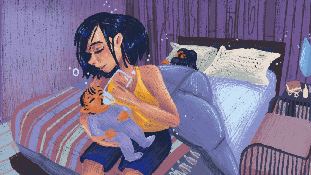
After we sorted that, I started cracking on with our illustrations. We decided that each in-app course would feature a different family and a child at a different stage of development. So this first baby sleep course featured our lovely family of 2 with a little baby. I came up with the house, the characters and their things to feature in our illustrations, for this first batch of 14.
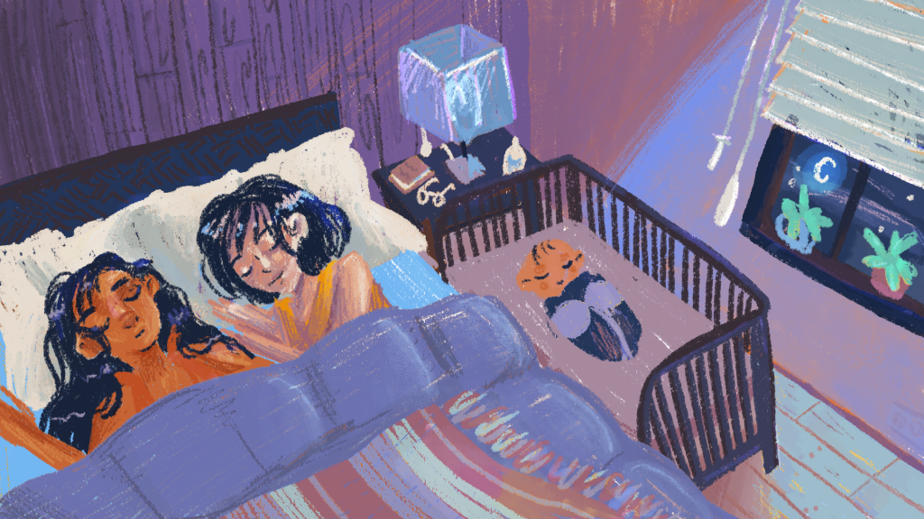
It went well! Now I just had to make like 90 more. Yay.
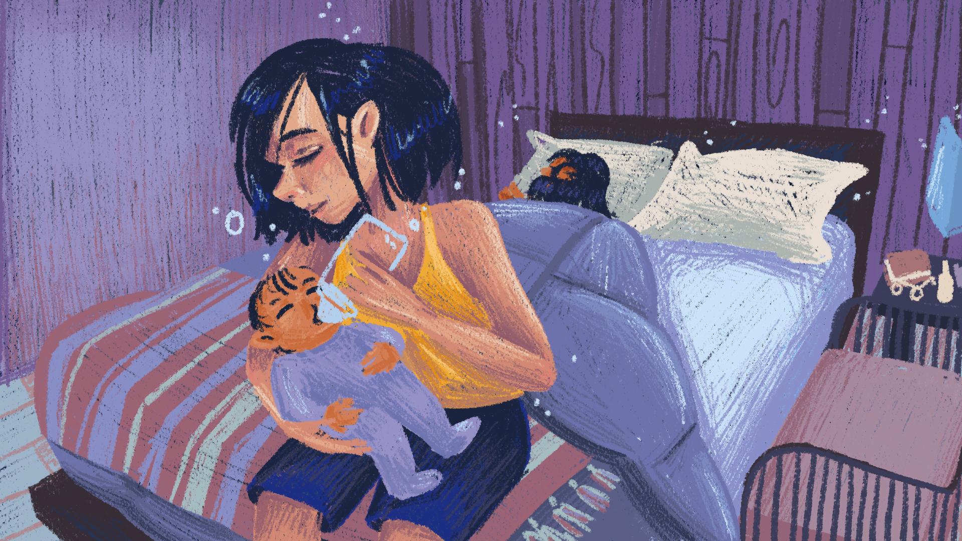
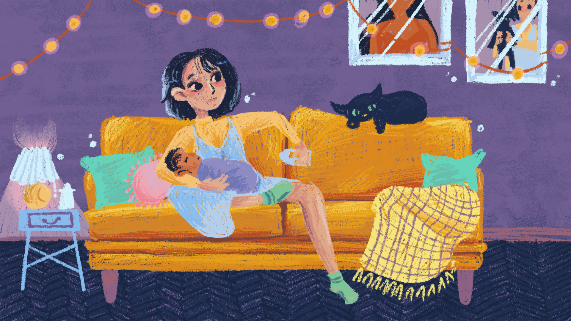
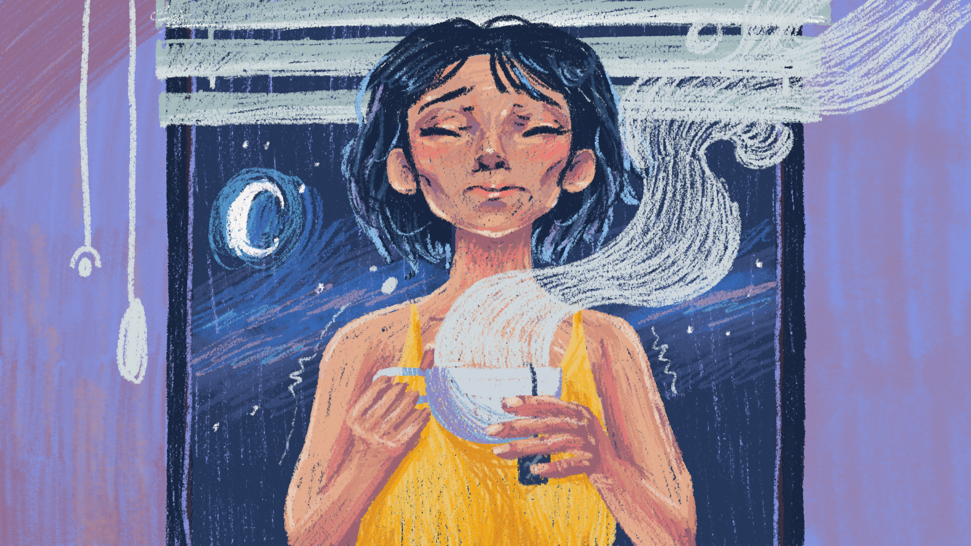
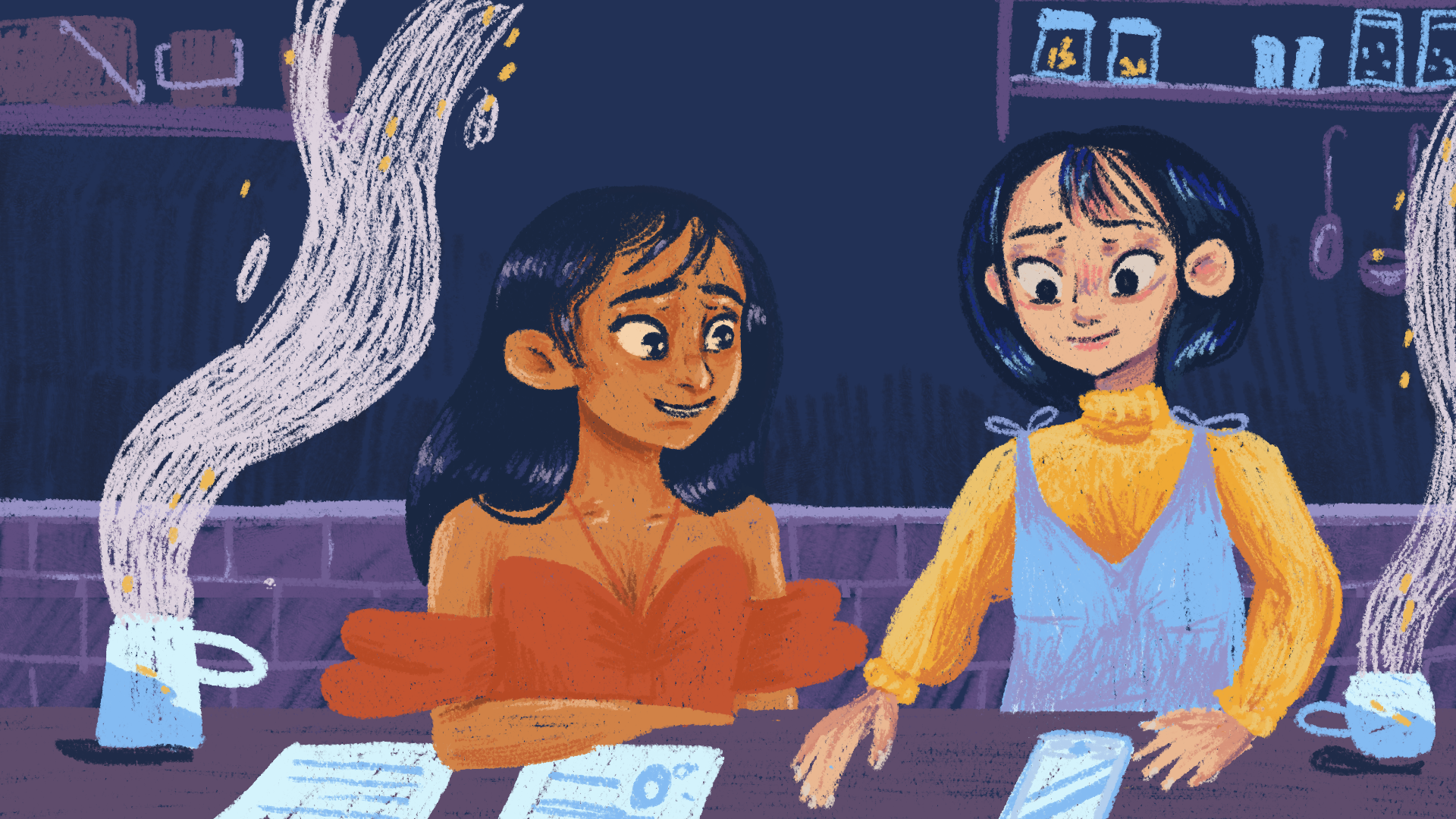
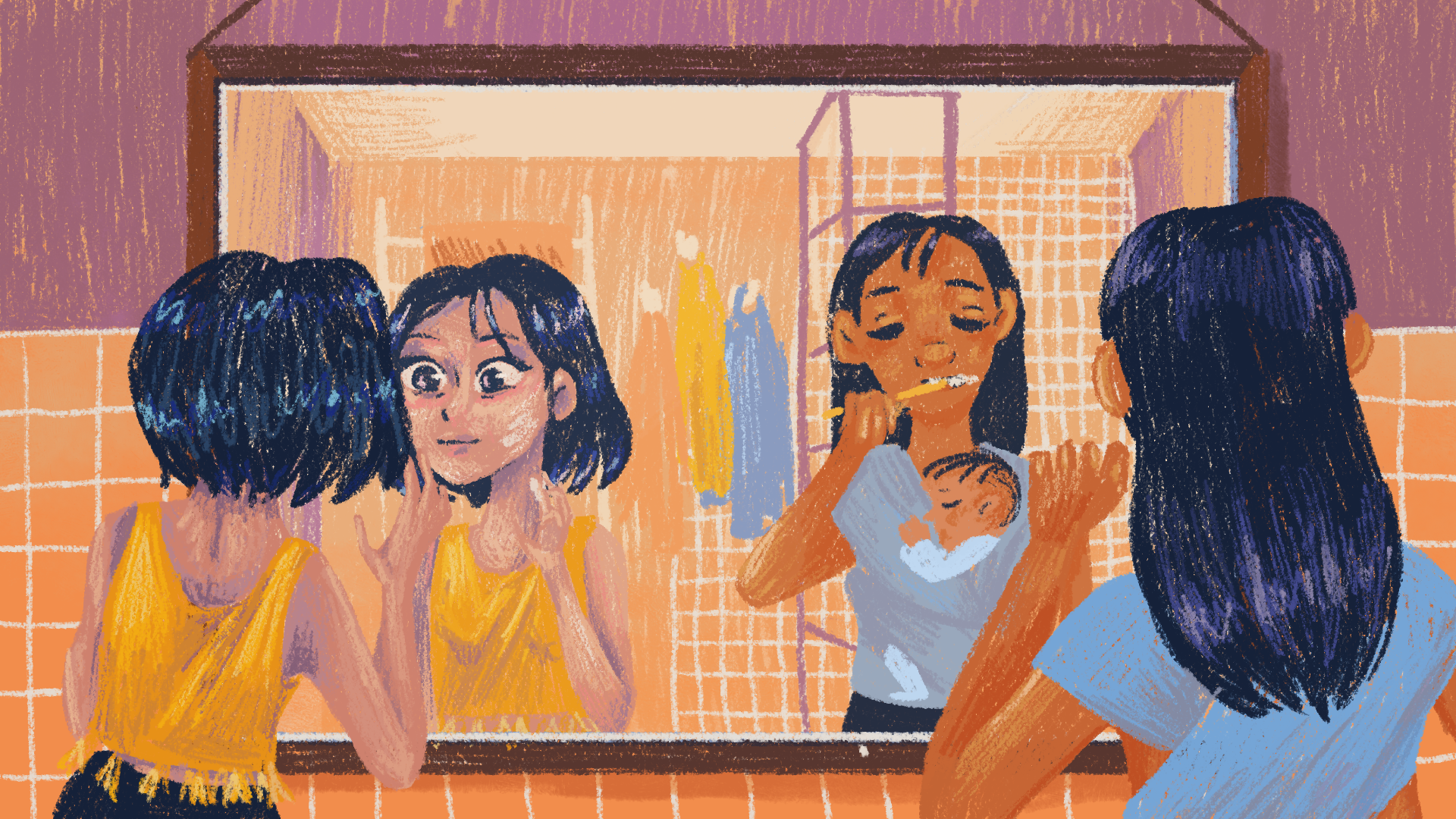
For the next illustrations, for the daily lessons, I focused the illustrations in on the household, rather than the characters. I felt this would keep the focus on the learning.
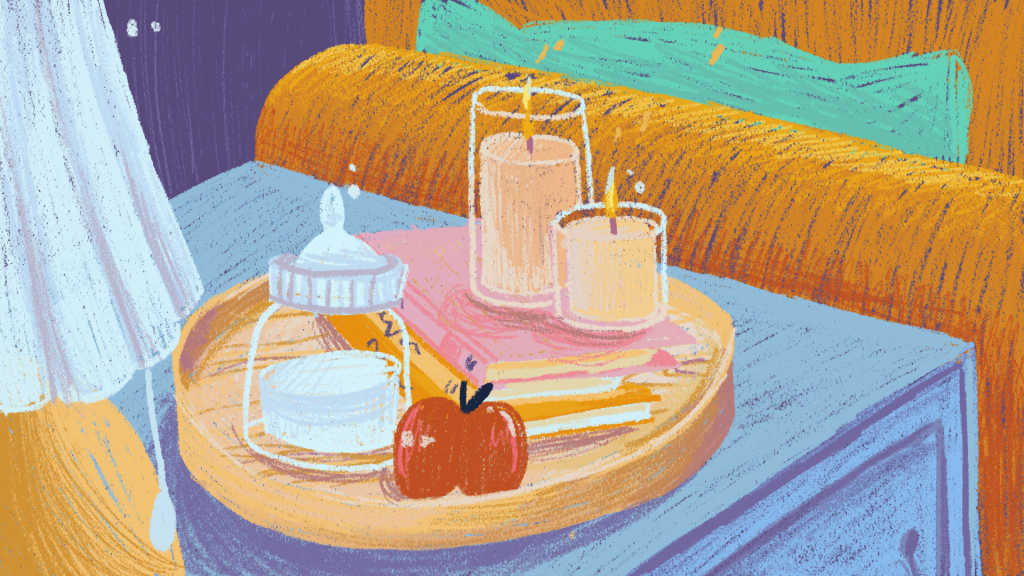
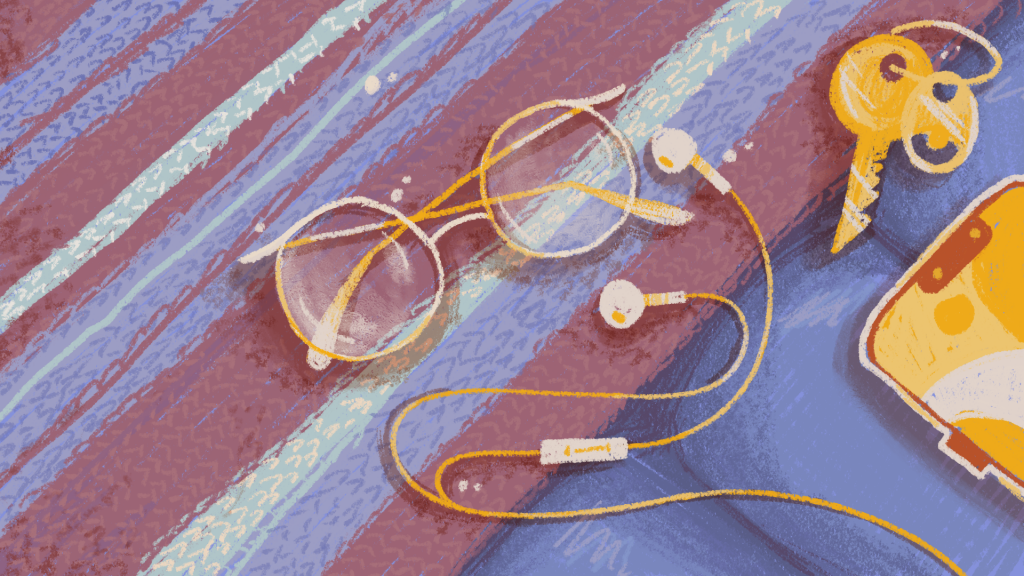
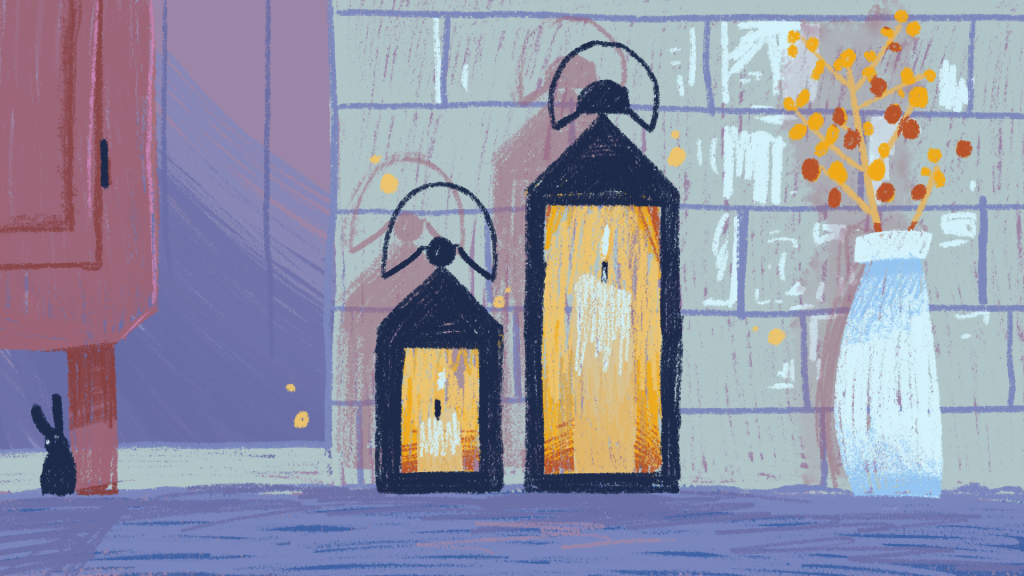
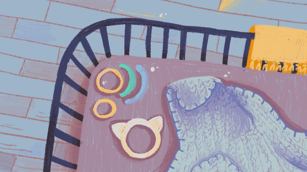
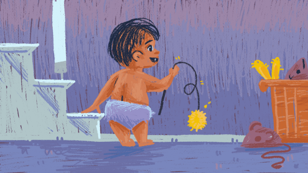
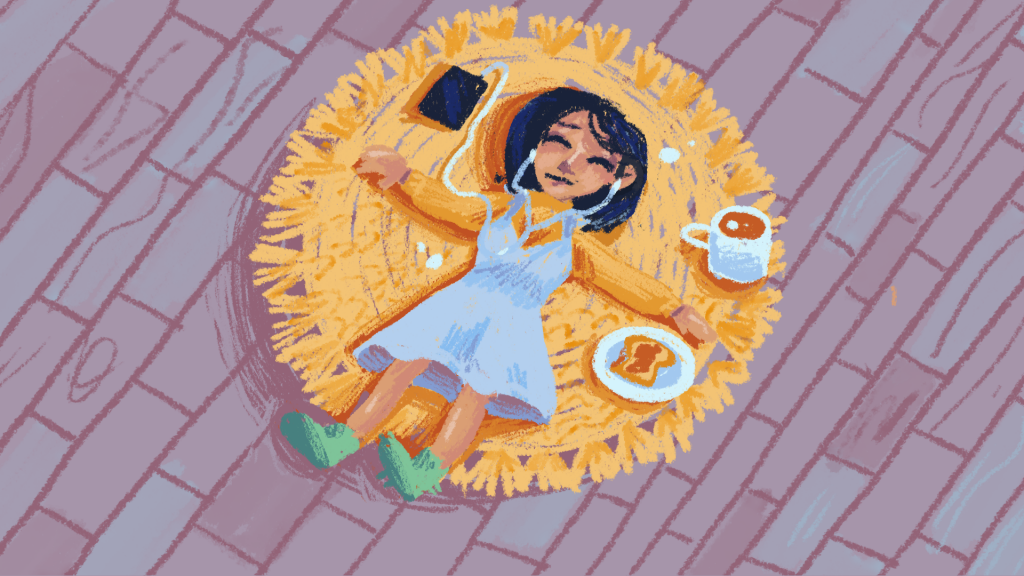
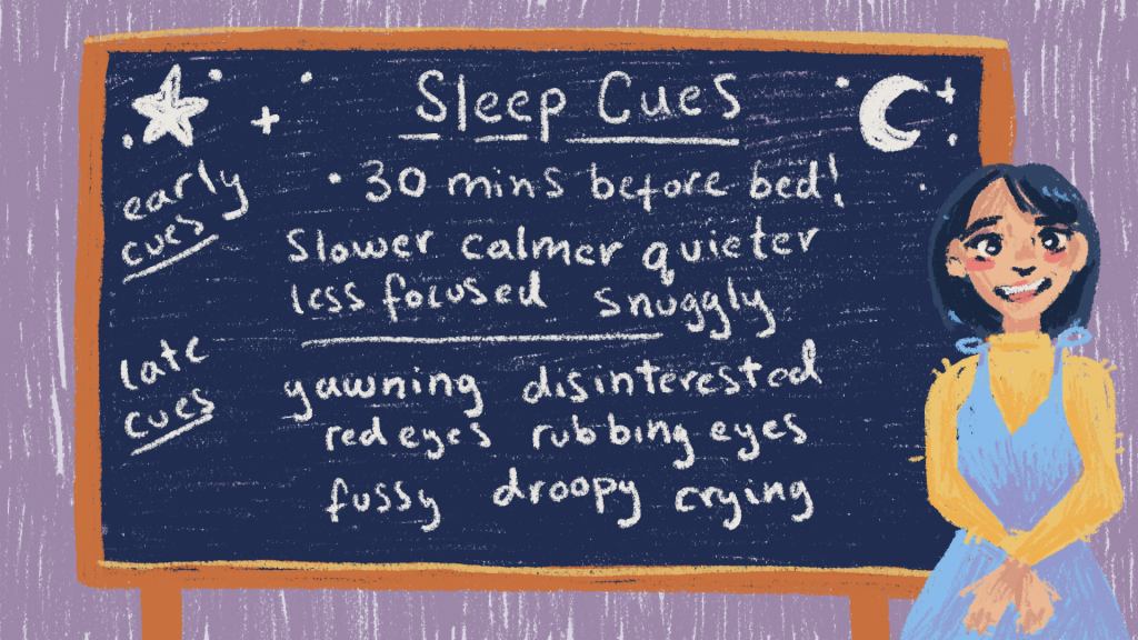
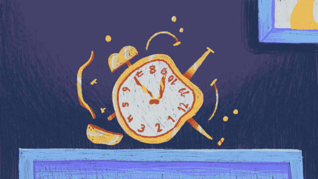
I was glad that it was done.
In this, I learnt that it’s not exactly healthy to do the exact same thing, week after week. It’s better to split things up into smaller projects to avoid getting overwhelmed. I did get better at drawing interiors, though!
Sleep sounds Album Covers
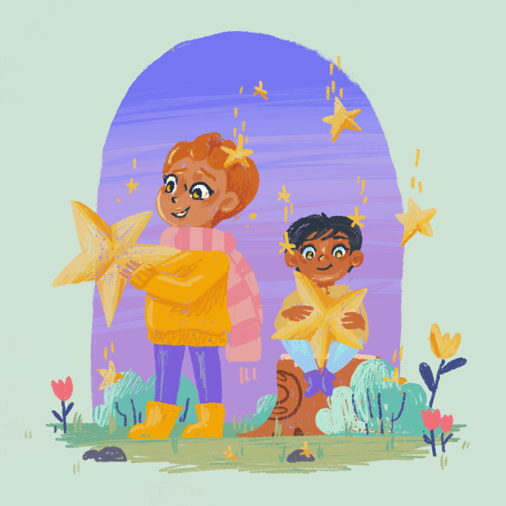
Let’s make some album covers!
Before I got around to it, our sleep sounds were super basic. Literally just gradient colours in the UI.
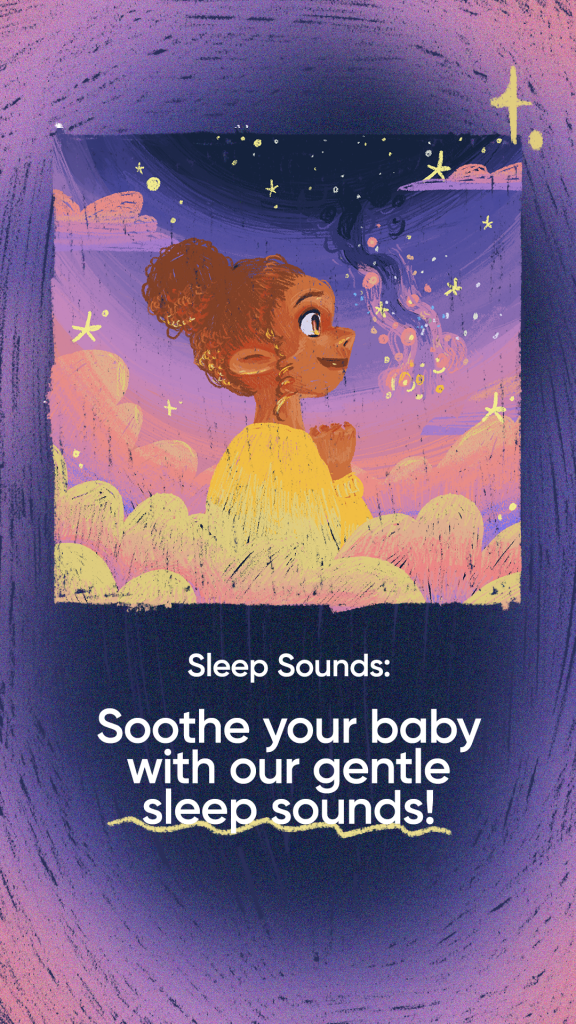
I followed all the proper procedure with these illustrations, putting them at the right quality, right size etc, etc. I wanted this album art to feel really really nice and I think I did quite a good job. Take a look at it!
These took a bit of time to workshop, but they’re very much in the same vein as our other illustrations, in that they work well on their own, as well as in funky UI layouts.
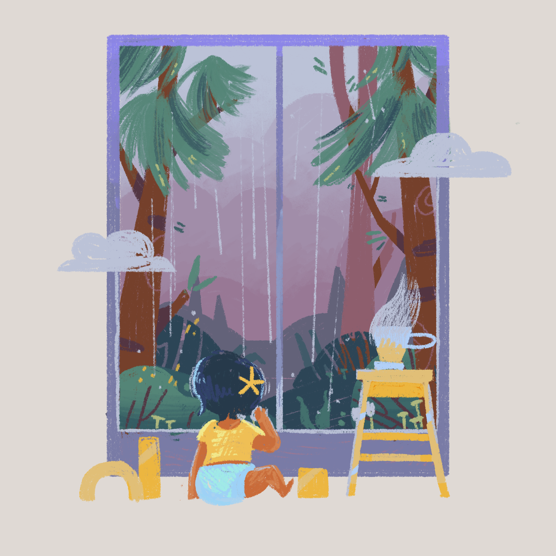
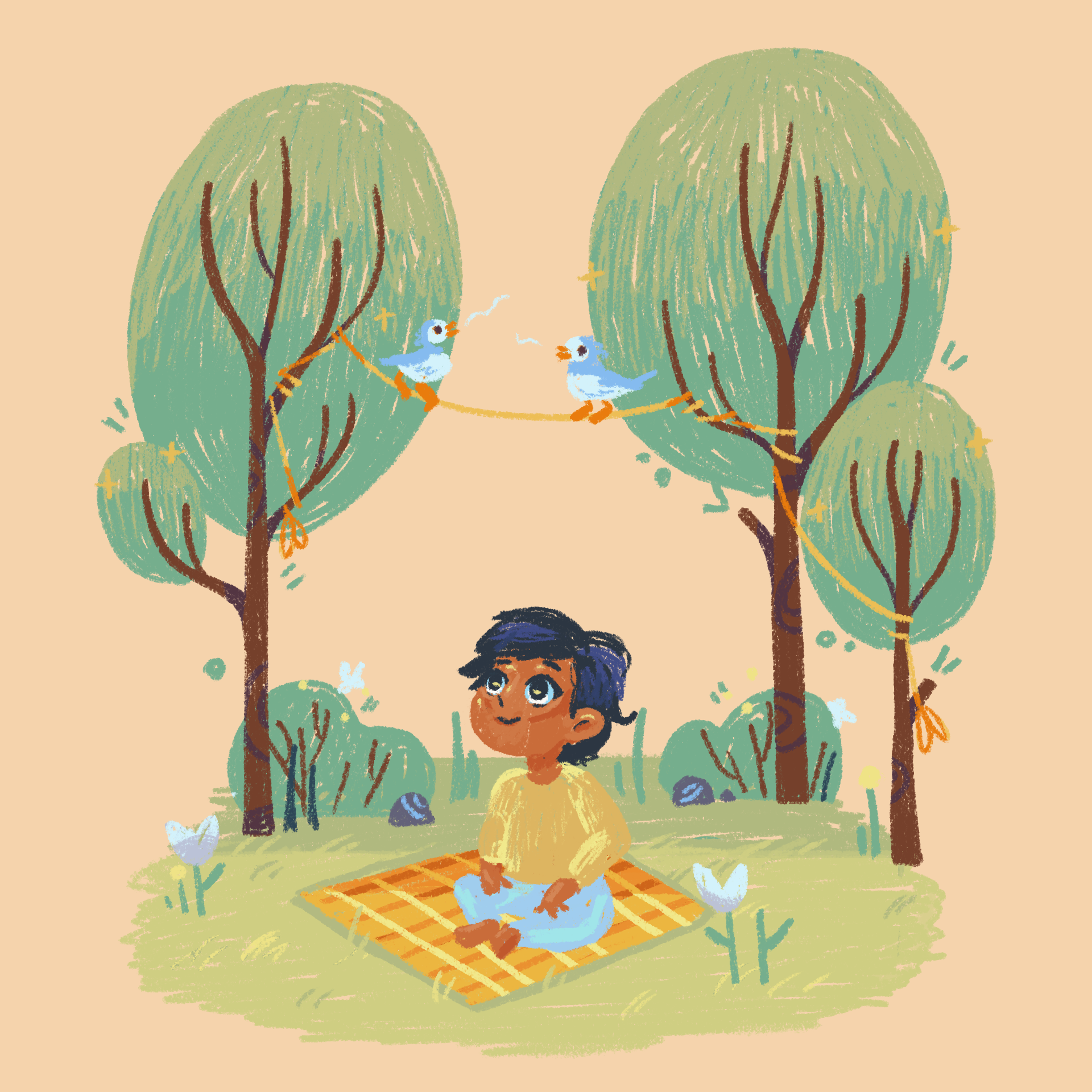
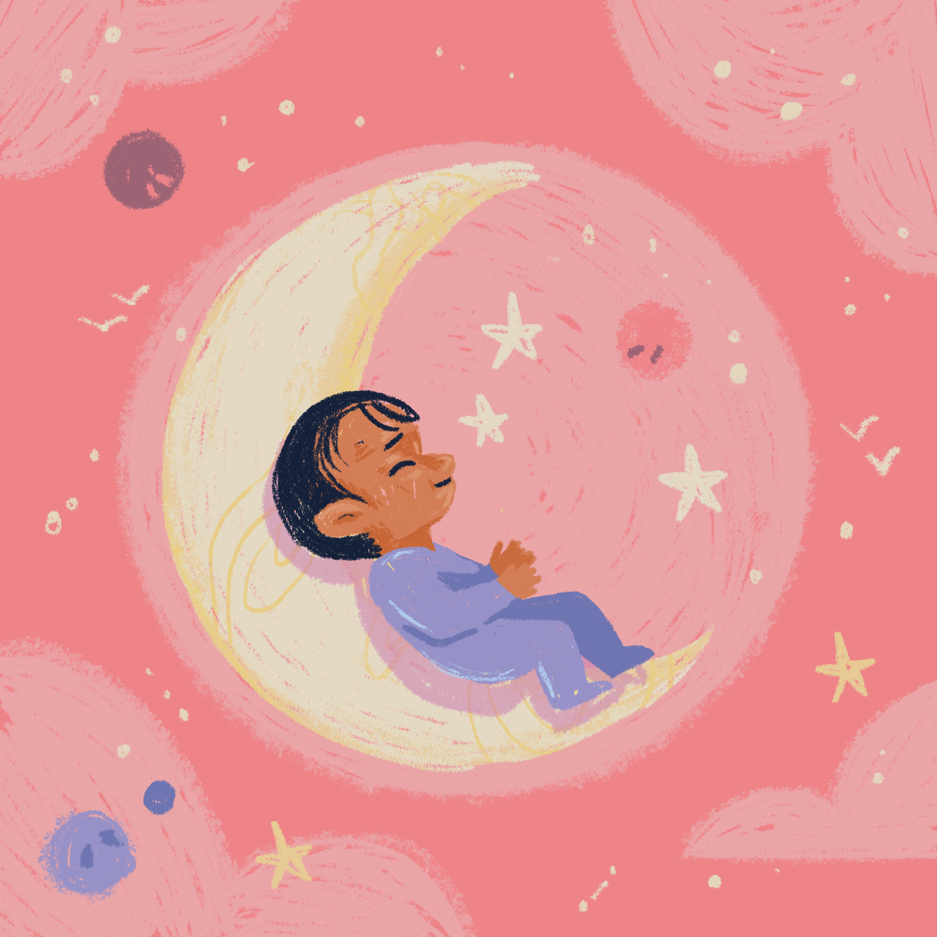
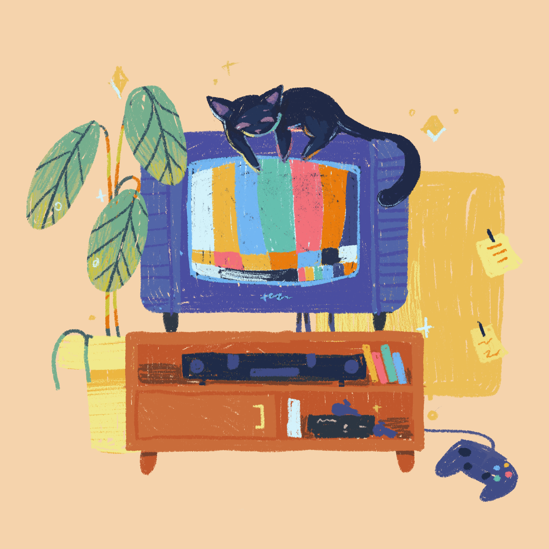
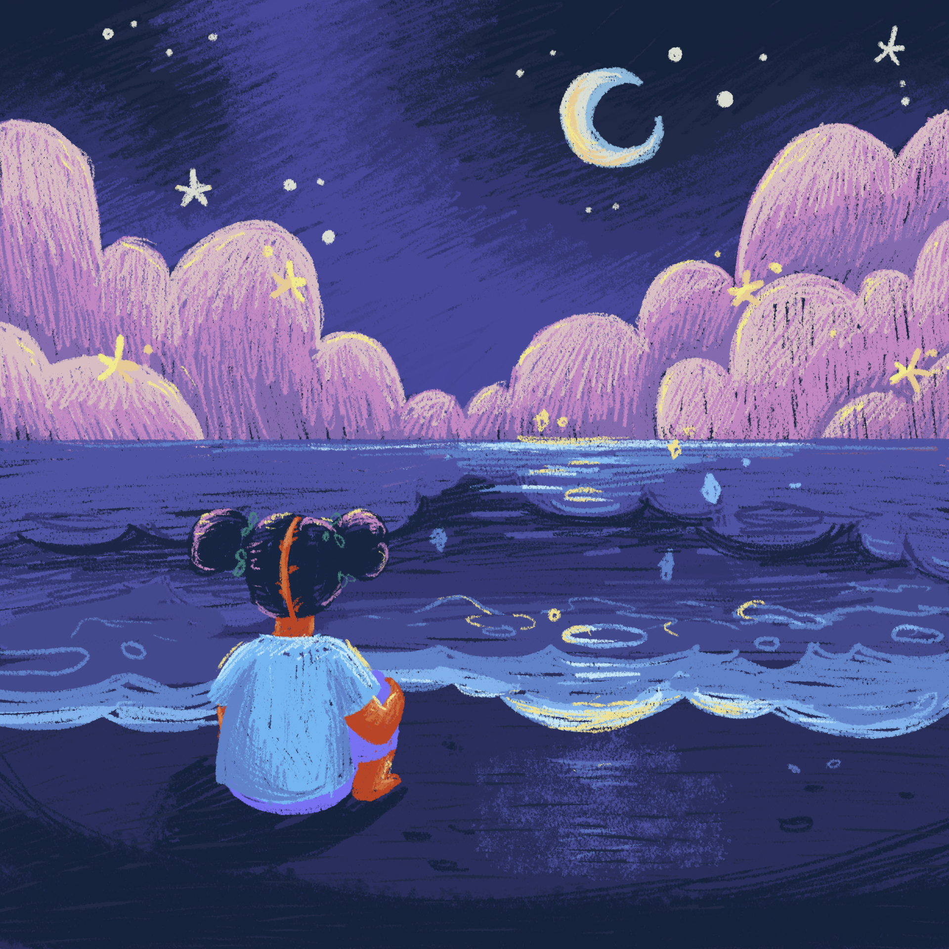
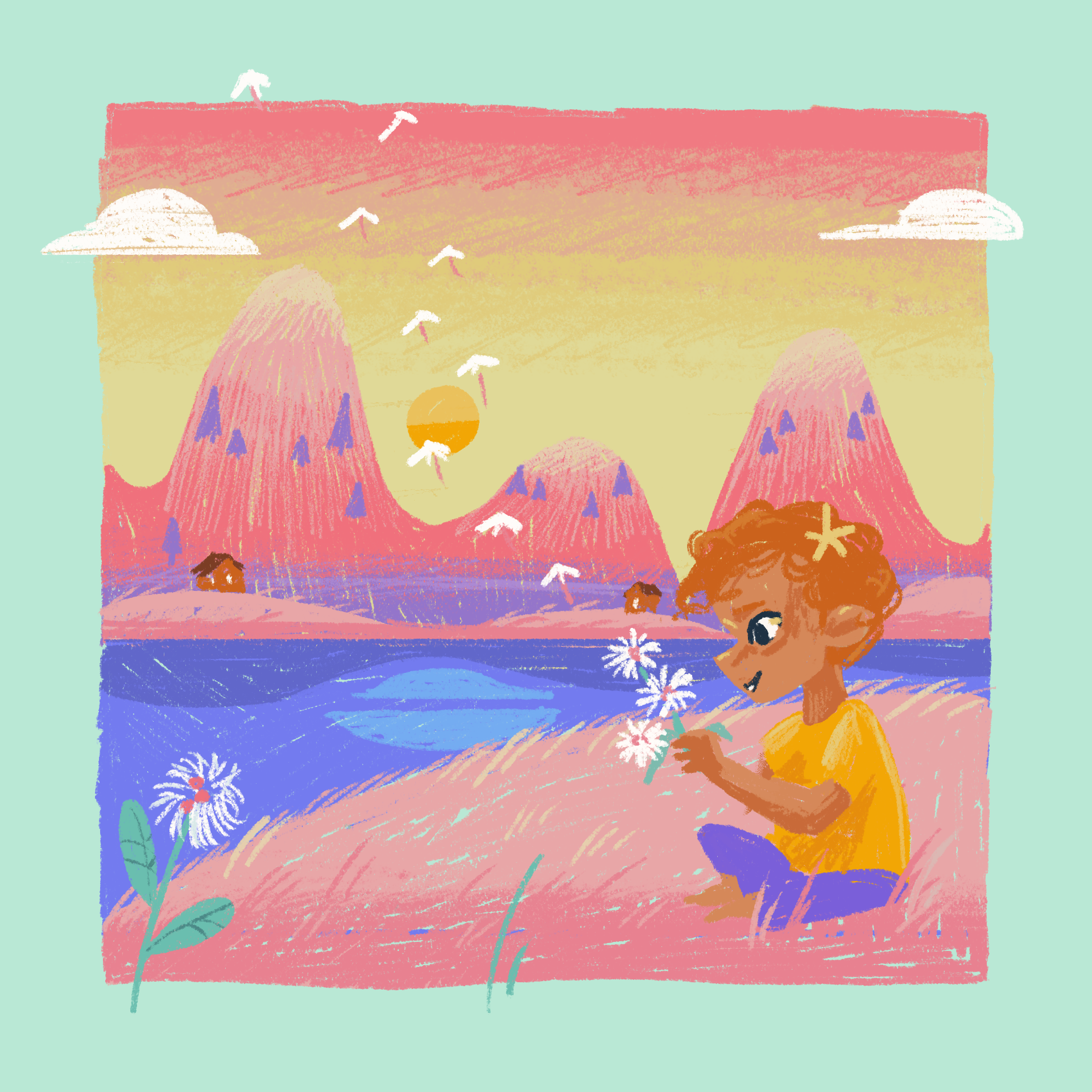
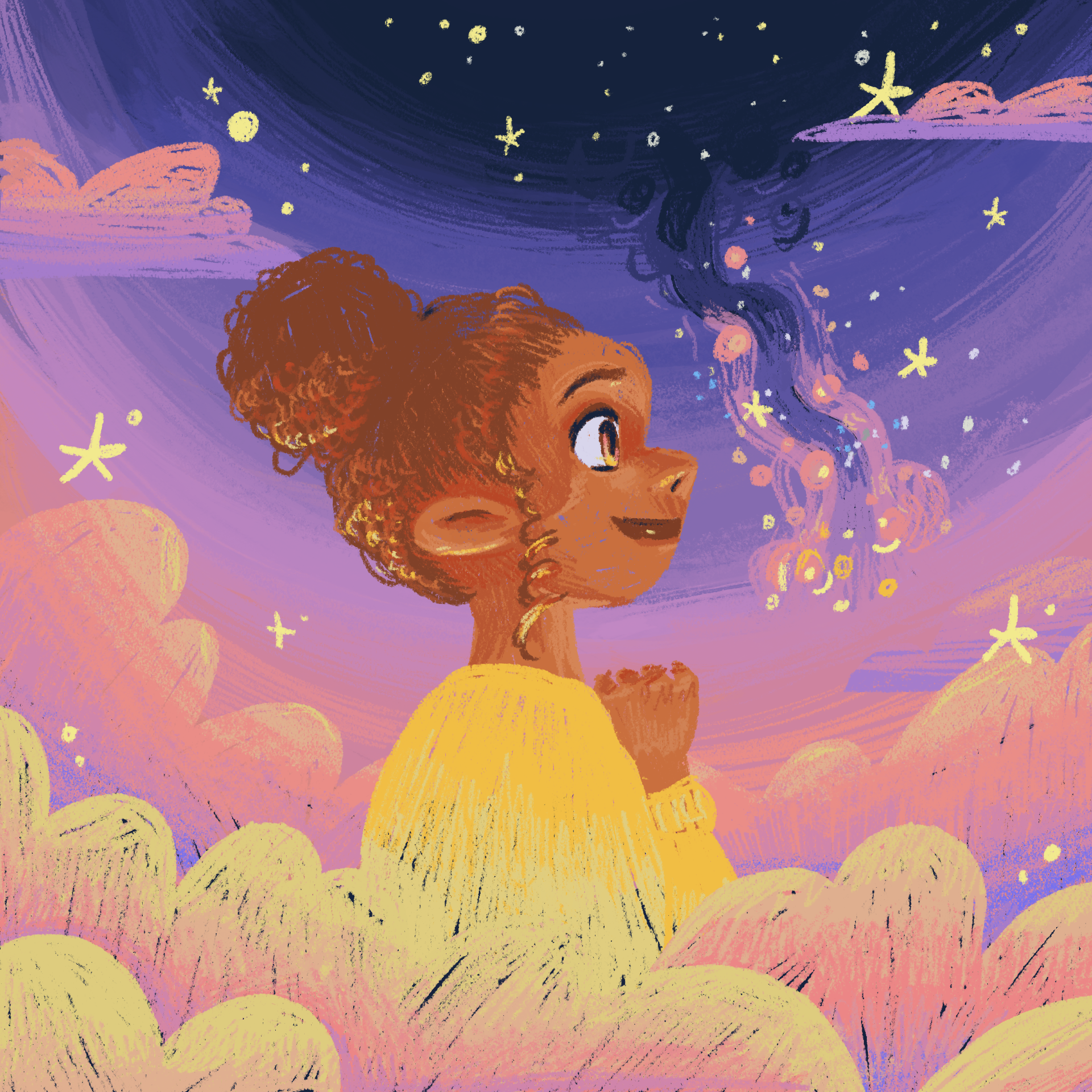
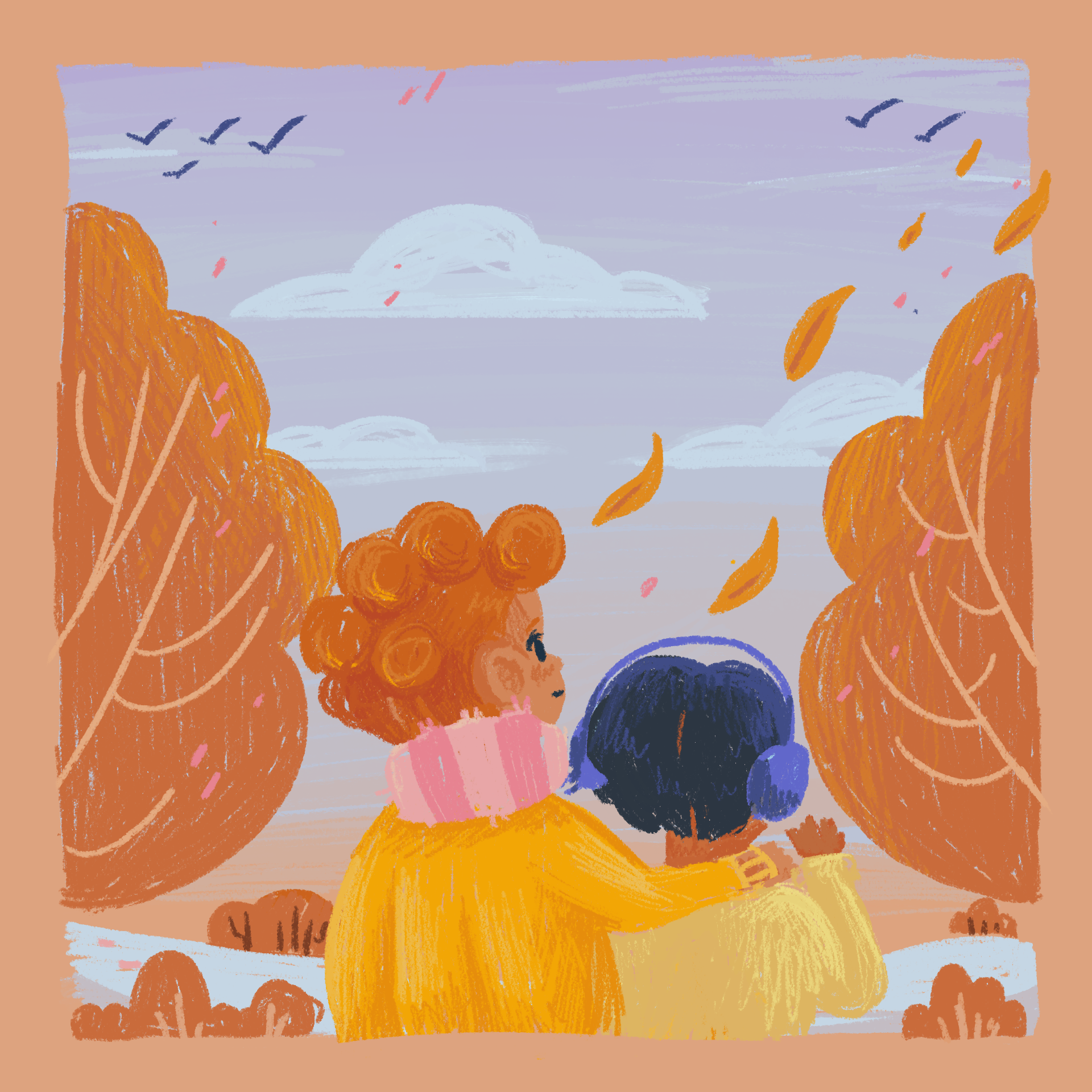
How do you like these Album Covers?
I’m into the childhood, nostalgic vibes. It came out of my nostalgia for new things, on a personal level. It’s sort of weird being an adult and having experienced most things before. Now it’s like a real surprise to interact with something completely new to me. I suppose that’s what made coming to a different country so rewarding. I got to learn a whole new language, interact with different people and overall become a whole seperate person from who I was before. It’s nice.
Thanks for reading my ramblings!
App Onboarding
We’ve been working on our onboarding since forever! It’s so difficult to design the “perfect start” because people can have varying experiences with our app. Some people haven’t learnt the language of “navigating apps”, so when you want to add some neat features, you have to think about whether it’s something a new person would learn, naturally, or whether it’s something worth teaching.
We also want to think about our brand touchpoints, reasons for using the app, and whether we’re collecting data to streamline the experience. It’s hard to design something “perfect” when there are just so many variables. (A bit more in depth here if you don’t get me here: We need data on both the parent & the baby & the partners & the goals of using the app. On top of explaining how the app works and what you can expect to get out of the app, it’s really difficult to make a succinct app onboarding when you need all this stuff.) So we’ve been changing it every few months to increase our retention numbers. (Retention is how long people continue to use the app once they’ve installed it. Have you ever downloaded an app and then just forgot about it because other things got in the way, or it was too much work, etc)
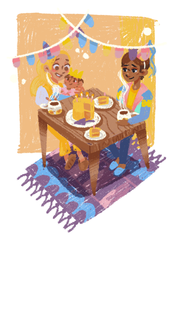
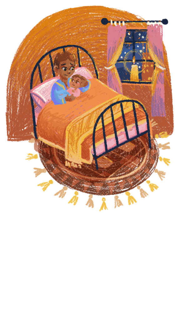
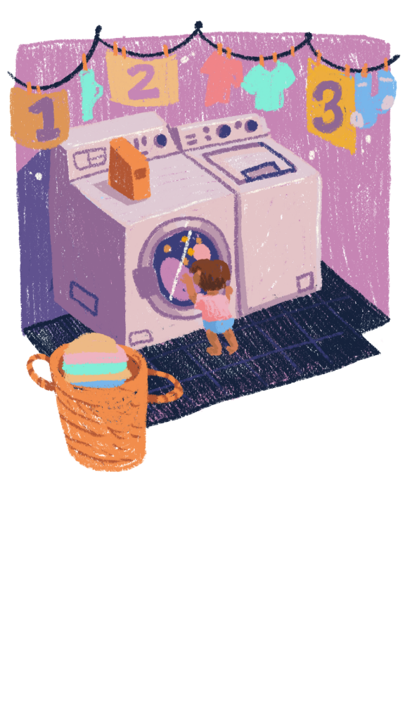
Here, we have some neat illustrations exploring the most important onboarding questions in the app!
Chronotype Feature
We’re building a chronotype questionnaire into the app! This will be a great way to better tailor schedules to our users! If you don’t know about chronotypes, take this quiz! https://thepowerofwhenquiz.com/ Everyone falls into 4 categories, Bears, Dolphins, Wolves and Lions. We can plot this, and give advice to parents depending on their and their babies’ chronotypes! Cool, right?
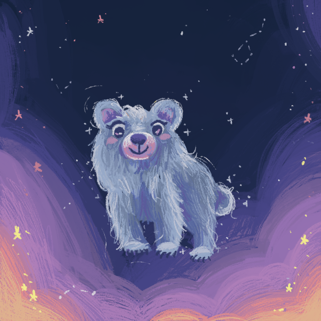
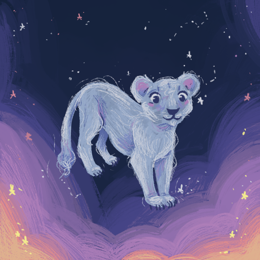
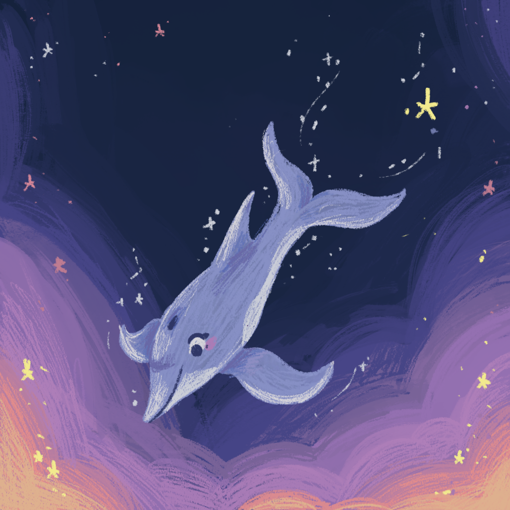
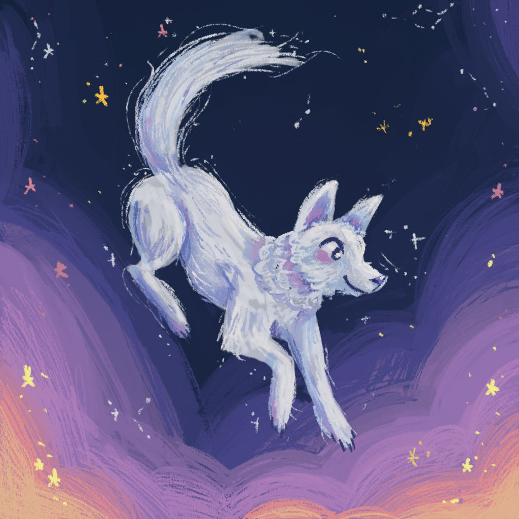
On the whole, App onboarding is tough.
It’s a lot of metrics to sort out, and we’re designing our experience to be as smooth as possible. This section is a current work in progress, so do bear with us here! Cheers!
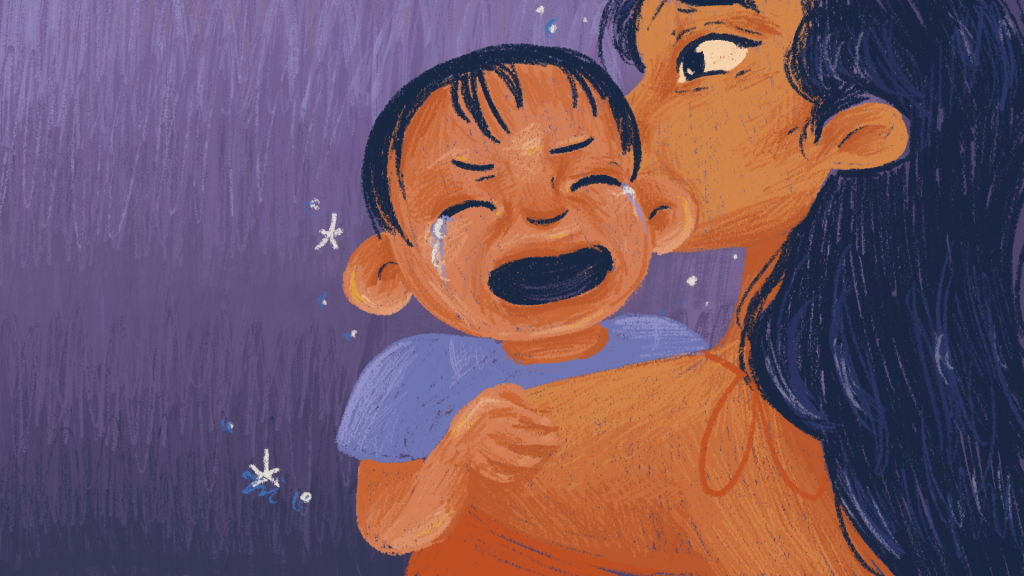
Character Design
Character design is not just about drawing a smiley face or sketching a person. It is about distilling real experiences and lives into something memorable, impactful and human.
The best character design is when it tells the story of the character in one glance. It tells you who they are, what they do, and what they represent.
Let’s explore the characters of Napper together!
Our Mascots
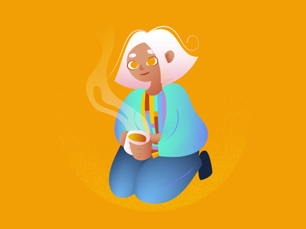
Developing our mascots, Charlie & Nap-R was a no-brainer. We wanted a compassionate friend to show people around the app, and we wanted a way to represent our AI & Algorithms. Basing Charlie on my darling friend Christine, I used the App colours for her clothes.
With Nap-r, we were thinking along the lines of “what are people already familiar with, technologically?”. Handheld devices, Phones, Controllers, Baby Monitors and gaming things came up in my head. We put those together and there he was. Our little egg guy.
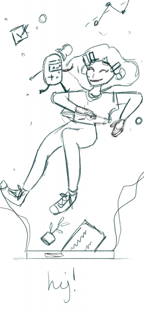
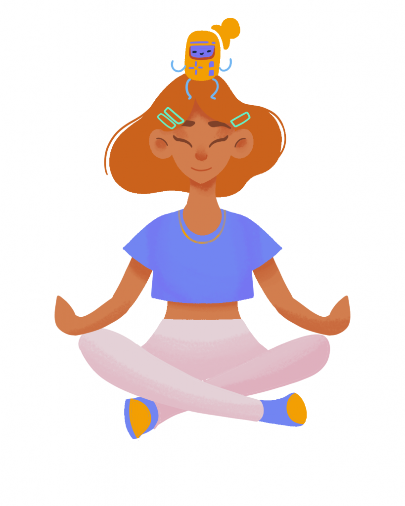
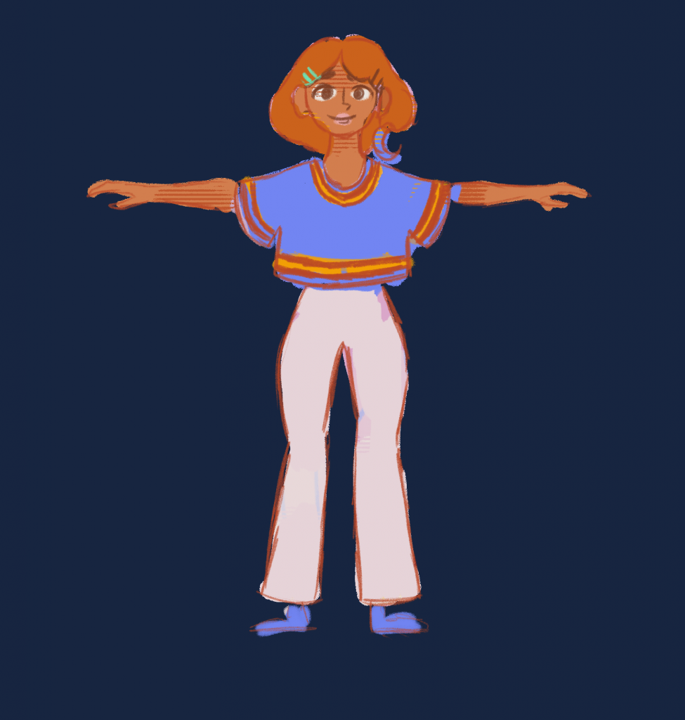
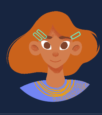
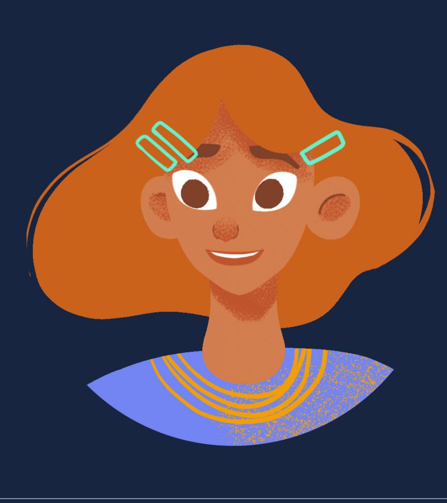
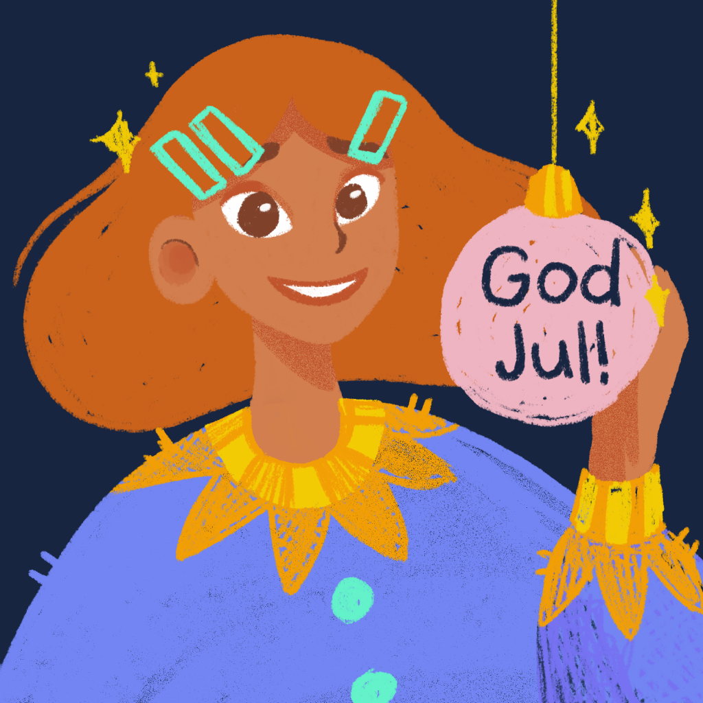
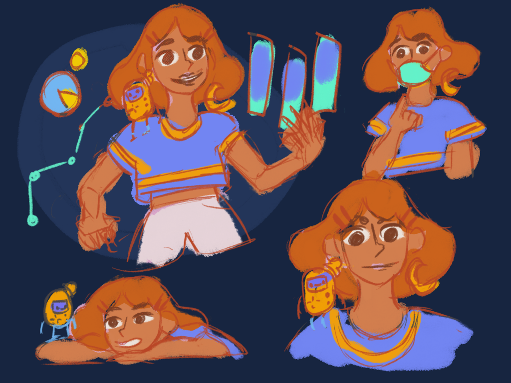
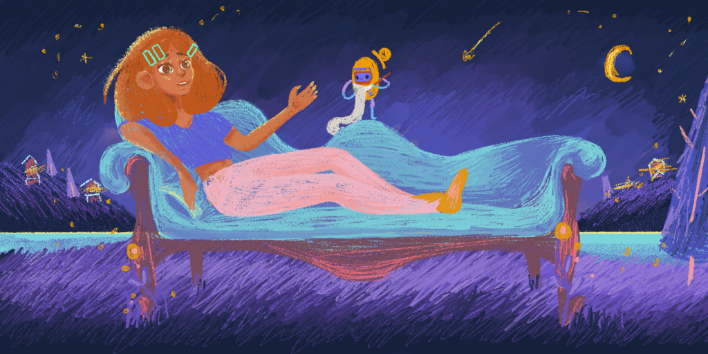
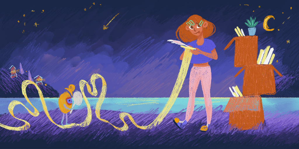
I think that the mascot designs are good. I like the dynamic between Nap-R and Charlie. I like that Charlie is personable in design and look. She’s not supposed to be attractive, she’s supposed to make you feel welcomed and reassured.
Aliquam tempus mi nulla porta luctus. Sed non neque at lectus bibendum blandit. Morbi fringilla sapien libero. Duis enim elit portitor id feugiat erat.
Our Families
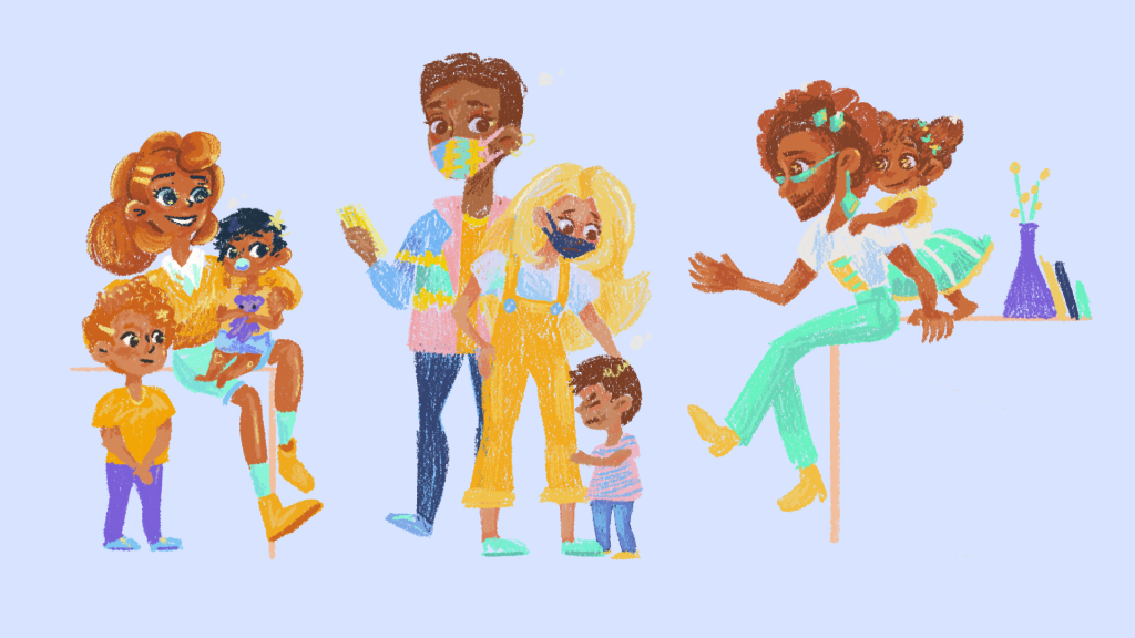
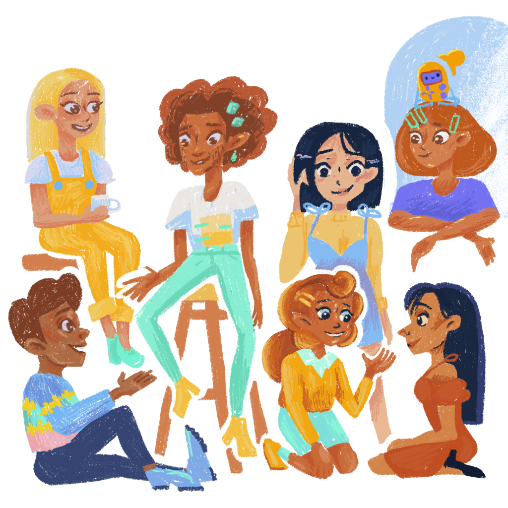
Each of our families tackles a different section of our users, parents of young children in North America & Europe. When I designed them, I wanted them to reflect different parameters. Family Structure, Ethnicity, Child Age & Parent Age. I felt it was important to reflect these, to make everyone using our app feel like they can see themselves here. Everyone is welcome.
In terms of Family Structure, we know how difficult it can be for different people to navigate varying responsibilities. Some people are raising children alone, others have a partner, and others have supportive grandparents. We reflected on this here.
Baby Age was really important to think about because different levels of development pose dramatically different challenges. Newborns have no circadian rhythm, while 3-year-olds are just beginning to understand that they can push boundaries. To make sure that everyone was seeing themselves & their babies, I made sure there was a variety of different stages of development, as well as some sibling interactions!
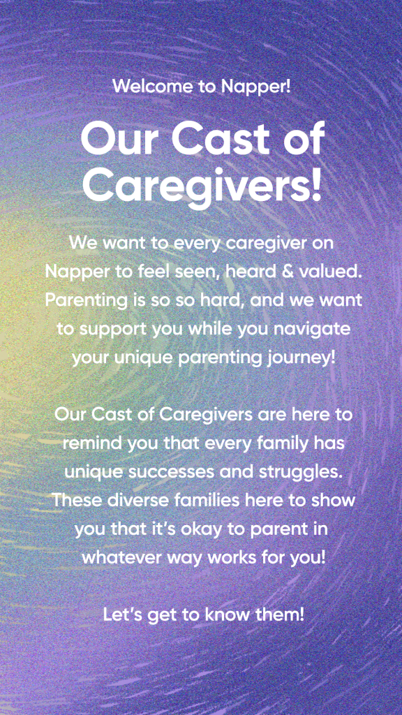
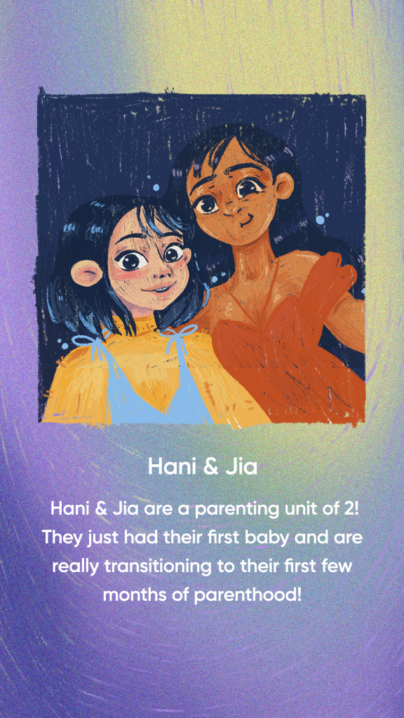
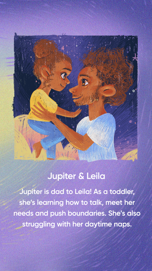
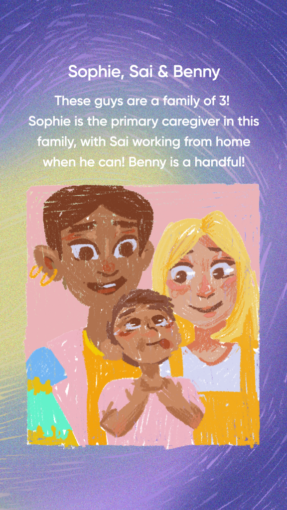
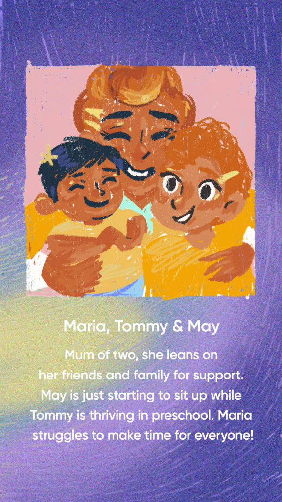
I think I did a pretty good job distilling down the average parent into just a few familiar characters and families. What do you think?
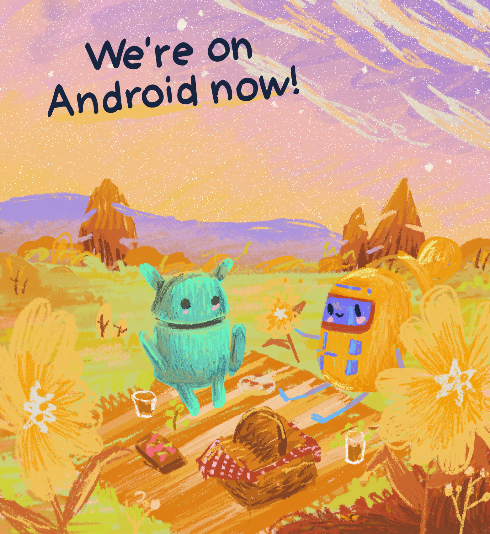
Napper’s Social Media
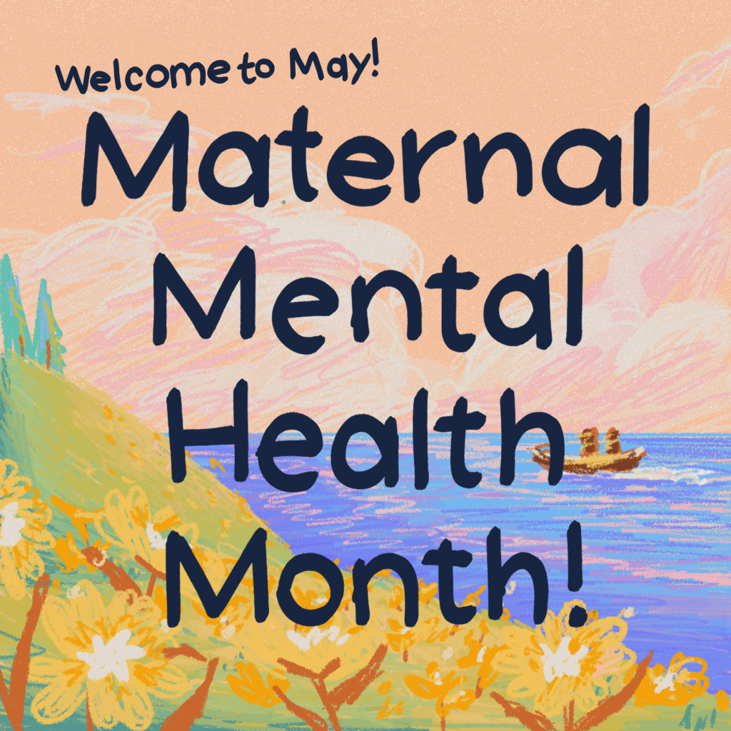
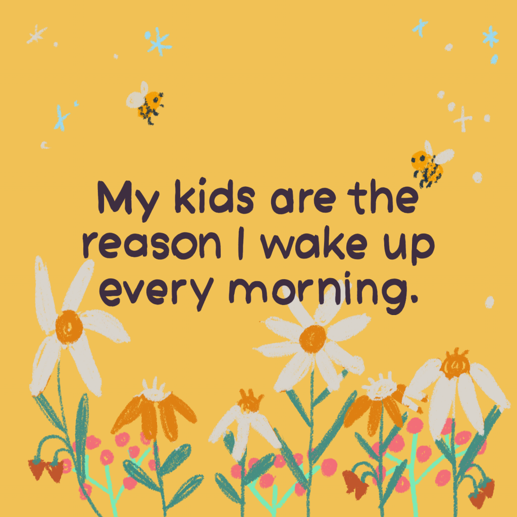
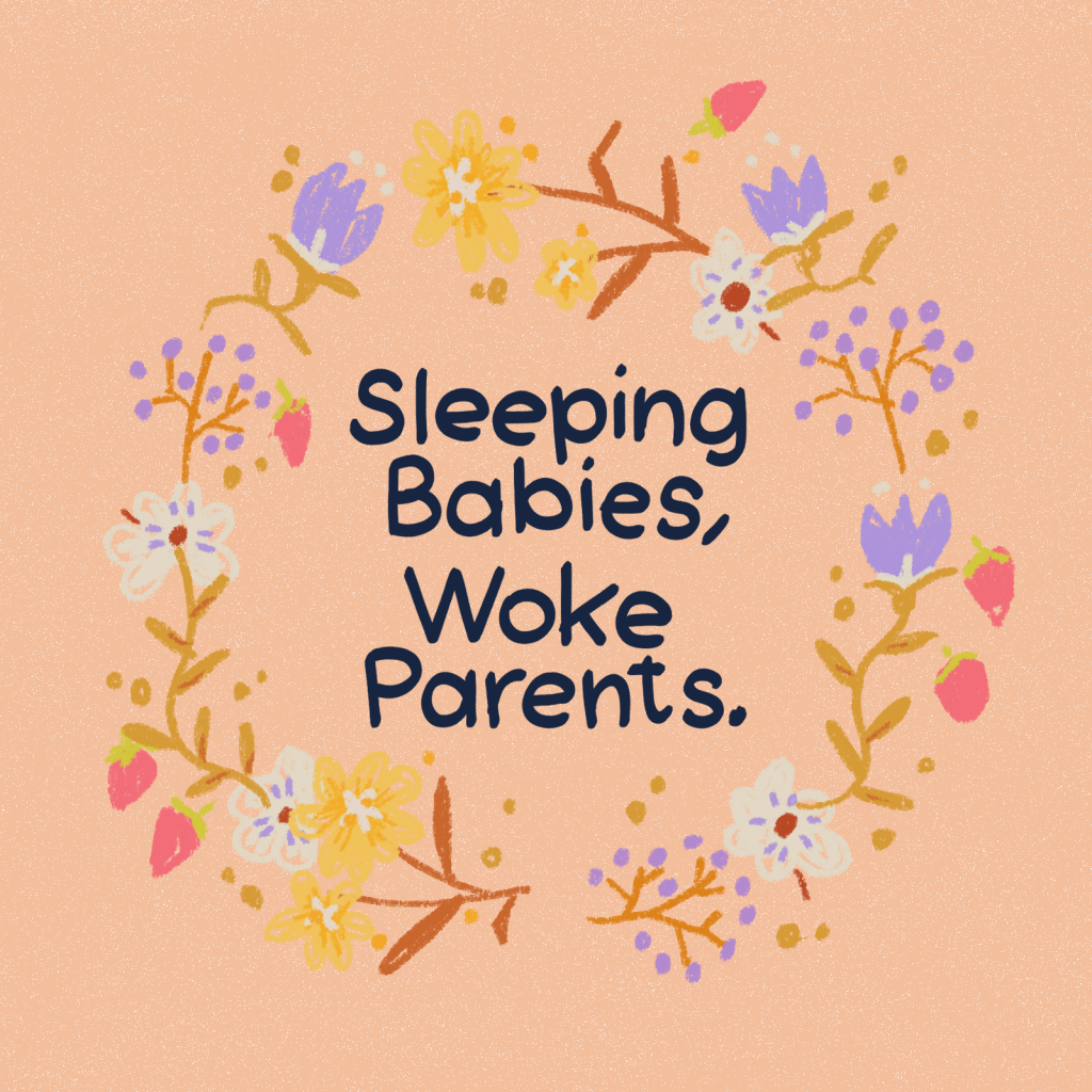
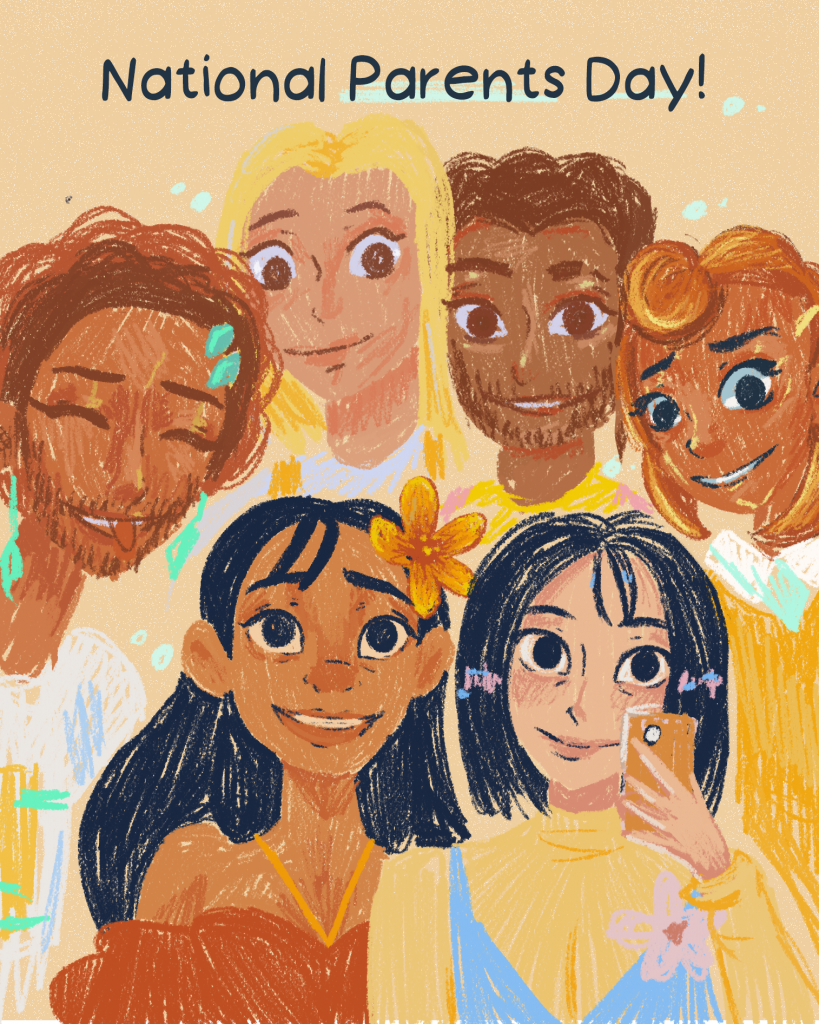
I built content for Instagram & Tiktok
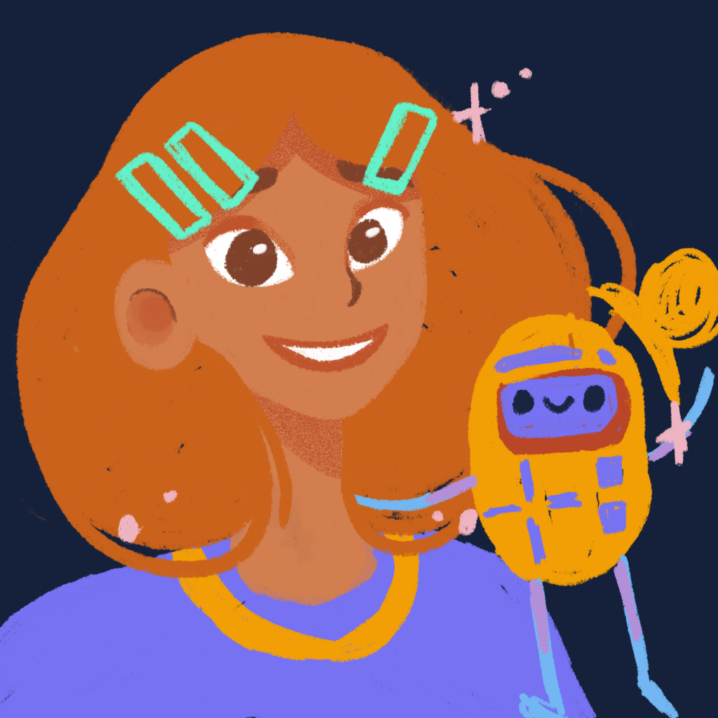
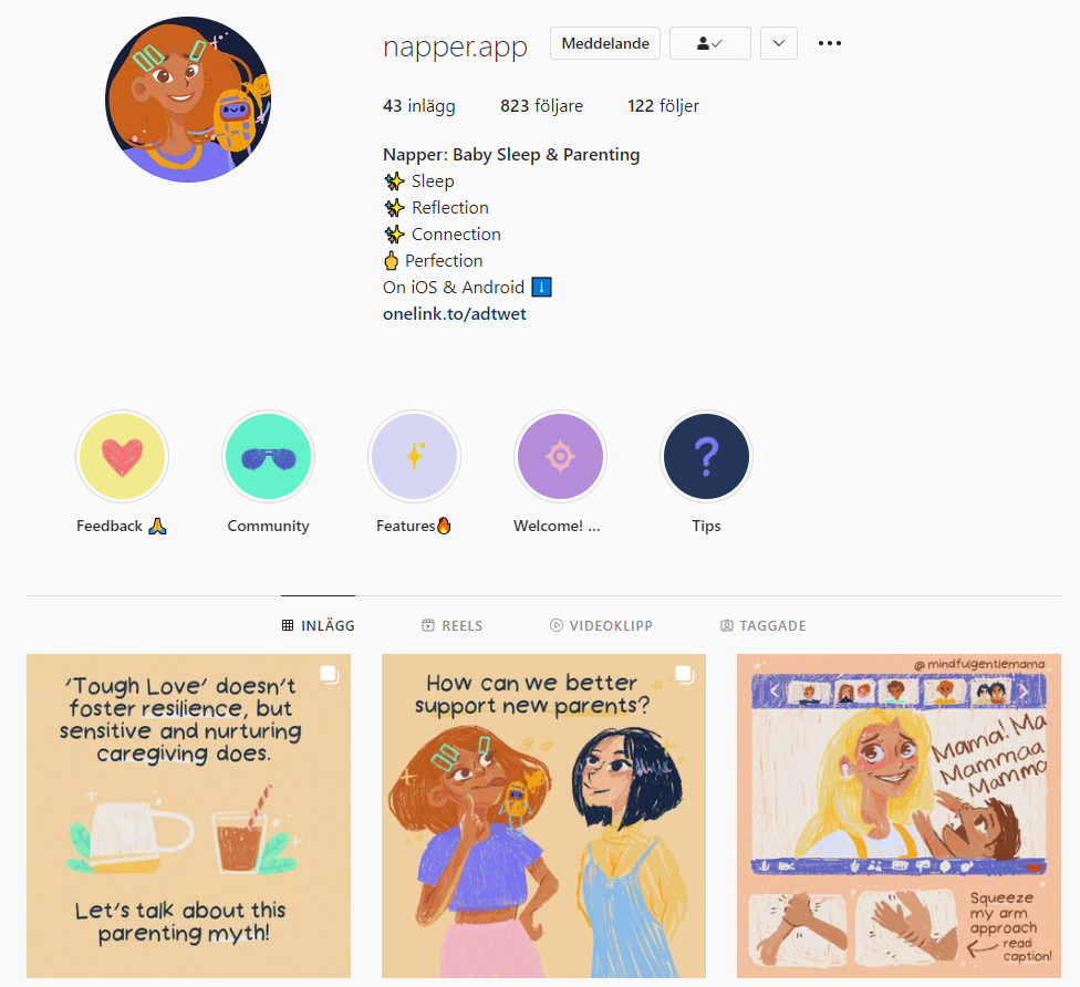
Static Profile Work
We spent quite a bit of time creating legitimacy through our social media profiles. It took a while to optimize, but we’re at a stage where we haven’t felt the need to change it in a while.
